Color speaks first in an office space. As soon as someone enters, the colors they see set the mood. This happens even before they notice the furniture or lights. Designers and experts, following Angela Wright’s work, see color as an important signal. It tells us if a place is safe, lively, or peaceful.
Knowing how colors affect us at work helps design teams pick the right ones. Blue is great for focus and trust. Green reduces eye strain and boosts creativity. Brighter colors like yellow, orange, and red can encourage teamwork or fast action if used carefully.
The shade and what colors it’s paired with are key. A bold blue can energize, but a soft grey-blue calms. No color is a bad choice on its own. But, the setting, finish, and light can change how it works. Brands like Benjamin Moore, and advisors like Space Refinery, suggest using calm colors with some bright spots. They also recommend testing these colors in the actual light of the office to keep everyone happy and productive.
This guide offers tips on choosing colors that make a workplace better. The right colors can match the mood needed for each task, improve mood, and help avoid errors. For example, using too many bright colors can be too much. Picking colors wisely for each room is a smart way to help everyone focus and feel good.
Key Takeaways
- Office color trends influence first impressions and long-term mood in the workplace.
- Workplace color psychology links specific hues to behaviors—use blue and green for focus and calm.
- Balance saturated accents with neutral bases to protect employee productivity.
- Test office paint colors in real lighting and consider sheen to avoid unintended effects.
- Follow proven guidance from brands like Benjamin Moore and designers such as Space Refinery for palette planning.
Why Color Psychology Matters in the Modern Workplace
Color quickly catches our attention in any room. Studies show that colors can make us feel and act differently, not just at home, but at work and school too. Using colors thoughtfully can make customers happier and teams more efficient. This shows how design choices directly impact workplace wellbeing.
Evidence backs these design choices, not just guesswork. Here, you’ll find quick summaries of the science and practical tips.
Scientific background on color and behavior
Research over many years links color to our physical and mental reactions. For example, a study in 1979 found that pink rooms in prisons led to less fighting. This proves color can truly change how we act. Another study found that colorful rooms make us more alert than dull ones; blue makes us relaxed, and red makes us more awake.
How color shapes mood, focus, and productivity
Colors affect how our bodies respond. Red, for instance, can make your heart beat faster and you more alert, but only for a while. Blue helps us stay calm and focused, even when stressed. Green reduces eye strain for better focus over long periods, while yellow boosts memory and creativity but should be used sparingly to avoid eye fatigue.
Practical design implications for U.S. offices
- Pick colors based on work needs: use calming blue for stressful jobs.
- Add yellow touches in creative spaces for a burst of innovation without tiring out staff.
- Choose green for areas where people work long hours to lessen eye strain and help them last longer.
- Use red in small amounts in areas where a little energy can improve work.
- Always test paint in the office’s lighting and mix with whites or neutrals to keep the mood right.
Choosing colors based on their function helps everyone work better together. By carefully using color psychology, we can make office spaces better for everyone’s wellbeing.
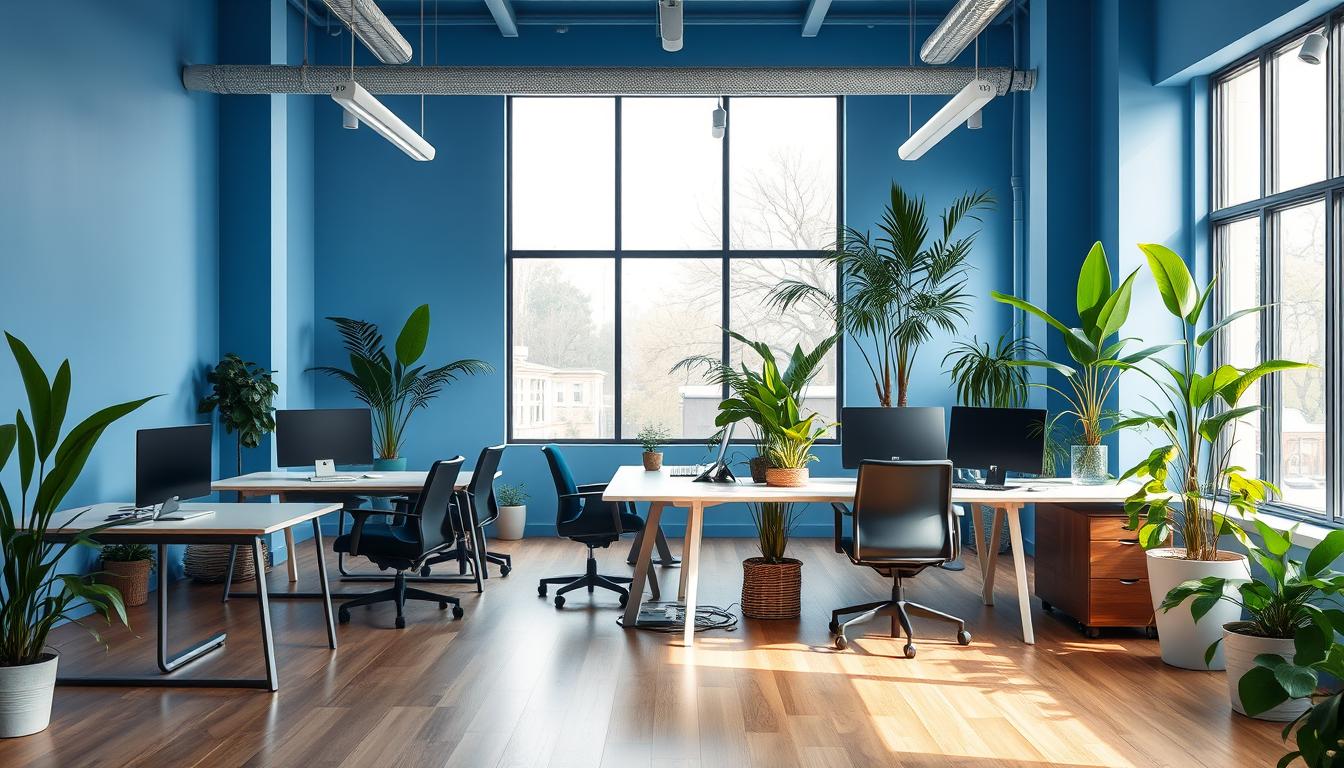
Cool Color Trends: Blue and Green Schemes for Focus and Wellbeing
Cool color schemes can transform a workspace. Blue and green hues bring calm, focus, and balance. Pick shades that match your work and lighting.
Blue as a productivity enhancer
Blue boosts clear thinking and eases stress. It’s great for productivity. Soft blues like Manor Blue work well in places needing focus.
Yet, too much blue can seem cold. Mix it with warm colors and materials for a cozy feel. Check the colors in different lights to make sure they’re right.
Green for calm, reduced eye fatigue, and creativity
Green stands for growth and comfort. It eases eye strain and helps focus during long screen times. It also sparks creativity and keeps you balanced.
Adding green with plants and wood makes spaces feel alive. Soft greens like Guilford Green are perfect for peaceful areas.
Practical applications and room-by-room guidance
- For workstations: add green accents to lessen eye strain and boost concentration.
- In meetings and study spots: use blue to help with clear thinking and solving problems.
- In lounges: pick green with plants for relaxation and creativity.
- On walls: choose dull finishes to reduce glare and keep colors consistent.
Mix cool colors with neutrals to avoid a cold atmosphere. Include natural colors and plants to enhance wellbeing and link indoors with outdoors.
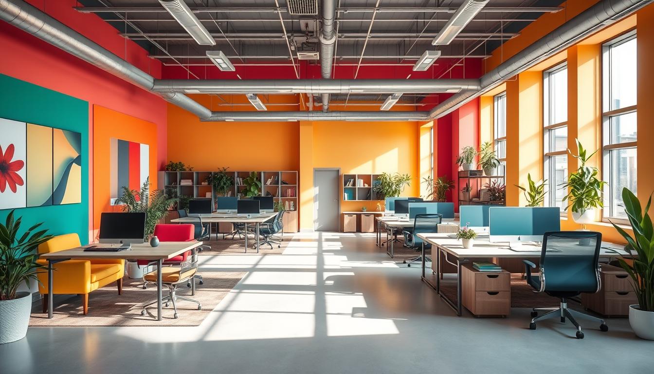
Warm Color Trends: Using Yellow, Orange, and Red to Energize Collaboration
Warm colors can boost the energy in team spaces if used right. Designers go for soft tones for long meetings and bright pops for quick creativity. Always check paint samples in your office’s light before deciding.
Yellow to spark creativity and optimism
Soft yellows are great in creative spaces. They make people more hopeful and open to new ideas. Lee Chambers says yellow helps keep information but too much can strain the eyes.
Orange for friendliness and sociability
Orange makes shared spots welcoming and boosts confidence. It’s perfect for lounges and eating areas. Adding coral touches keeps things friendly without being too much.
Red as an energizing accent with caution
Red can speed up the heart and help focus. Research says it’s good for tasks needing attention to detail. Use red in busy places but avoid it in quiet spots.
Design combinations that balance stimulation and calm
Mix warm and cool colors for the right feel. Combine red accents with soft blues or grays to calm the eyes. Yellow and orange touches in team areas can boost creativity while keeping the atmosphere relaxed.
- Use bold accents, not full-room saturation, for creative workspace colors.
- Test warm colors under the office’s actual light temperature to prevent glare.
- Balance vivid hues with white or soft gray to keep focus steady.
- Consider Benjamin Moore tones like Beacon Hill Damask or Sunlit Coral for softer options.
Neutral and Sophisticated Palettes: White, Gray, and Earth Tones for Balance
Neutral office palettes create a calm space. They support focused work with a versatile design. Use these shades to enhance mood, make spaces seem bigger, and give a professional feel to your meetings.
White and off-white as a flexible backdrop
White paint makes small rooms bright and open areas appear bigger. It’s chosen for its fresh look and how well it matches with bold colors. To avoid a too-clean look, mix in some textiles, warm wood, or art.
Gray for a modern, timeless workspace
Gray colors in an office can be light like dove gray or dark like charcoal. Light grays feel calm and clean. Dark grays make a room feel deeper and richer, perfect for meeting spaces.
Earthy browns and beiges for a studious, comforting vibe
Warm browns and soft beiges add a cozy, coffee-house feel to any room. Darker browns work well on shelves to highlight furniture and create a study-like atmosphere.
Sheen and texture considerations
For walls, matte or eggshell finishes reduce glare and feel luxurious. Use satin or semi-gloss on trim and doors for easier cleaning. Always test paint finishes under your office lights to dodge unwanted shine.
- Use neutral office palettes as a flexible canvas for targeted accents.
- Pair white office paint with textured fabrics and wood to prevent sterility.
- Match gray workspace colors to furniture finishes for a cohesive look.
- Apply earthy office tones on focal walls or millwork to add comfort.
- Consider paint sheen for offices to balance durability, cleanability, and screen glare.
Implementing Trends: Accent Walls, Lighting, Furnishings, and Biophilic Color Integration
Start by making a clear plan that connects color choices to their purpose. Use small changes to determine areas for teamwork, quiet work, or meetings. Often, these small tweaks can make a big difference visually without straining the budget.
Accent walls and color blocking
Create zones by using an accent wall strategy without needing to repaint every space. Using color blocking on parts of walls or freestanding panels helps signal different activities. Benjamin Moore recommends using a vibrant color like Peruvian Chili in moderation to bring energy to group spaces.
Lighting and paint interaction
It’s crucial to test how lighting and paint interact at various times in the actual room. The color can look different under warm or cool light. For most walls, matte or eggshell finishes work best to minimize glare, saving shiny finishes for areas where a reflection is desired.
Extending the palette with furnishings
Bring in lively colors through furniture like chairs or bookshelves. Using high-gloss finishes on some items can make a striking contrast with matte walls. Opt for pieces that are both sturdy and easy to switch out, keeping up with changing trends.
Biophilic accents and live greenery
Merge soft green colors with indoor plants to embrace a nature-inspired design. Incorporating green walls and natural materials can decrease stress and boost concentration. Positioning plants around screens can also help ease eye strain.
Practical checklist
- Test paint samples in the space under different lighting conditions.
- Try one accent wall before committing to repainting entirely to see how it feels.
- Match task lighting and general light with your color choices to manage contrasts well.
- Incorporate colorful furnishings and sound-absorbing decor to safely add more color.
- Add a variety of plants in common areas to maximize the benefits of a nature-inspired setup.
Conclusion
Office colors impact how we feel and work. Studies from Lund University and the University of British Columbia back this up. They suggest blues and greens help us focus and feel good. Meanwhile, using a bit of yellow, orange, and red can spark creativity and teamwork. Companies like Benjamin Moore and Space Refinery use these ideas to make offices better places to work.
It’s smart to pick colors based on what a space will be used for. Soft blues and greens are perfect for areas where focus is key. For spots where people come together to create, try bold yellows or oranges. Neutrals and textures work great as a base. They can tone down shine and let bold colors stand out without taking over.
But, it’s important to use bright colors like red or yellow carefully. Too much can make people stressed or strain their eyes. Test colors in the actual light of your office. You can add color with accent walls, furniture, and plants. Also, see what your team thinks before a big change. This careful way of choosing colors helps make sure changes are both pretty and practical.
To introduce new colors to your office, start small. Use little color samples and temporary decorations first. Ask your team what they think. Then, slowly bring in more color. This way, you lower your risks. Plus, you make sure the new look of your office really works for everyone. This careful approach makes updating office colors both smart and safe.
Content created with the help of Artificial Intelligence.