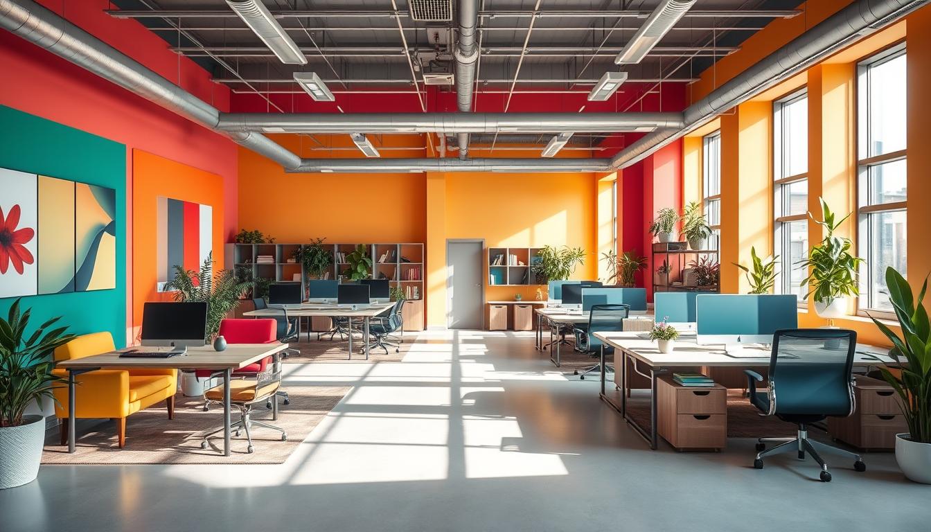
This article talks about how neutral colors in the office can help you focus better and get more done. Colors like white, gray, beige, taupe, greige, and black make the space less distracting. They create a peaceful environment for work, meetings, and showing products.
Studies and advice from companies like Benjamin Moore and Go Painting suggest that neutral colors are good for concentration and balance. Experts say that dull and soft colors make the office less overwhelming. This helps people keep their focus on long tasks.
You will find out which paint colors are good for the office and how to pick them based on how they look under different lights. There are also tips on using neutral colors to make a workspace where you can concentrate better. This advice is for office managers, interior designers, property managers, small business owners, and homeowners in the U.S. who want to choose colors wisely.
Key Takeaways
- Neutral office colors reduce visual clutter and can boost concentration in various work settings.
- Gray, greige, off-white, and warm taupe are practical office paint colors for focus zones.
- Light level and sheen matter—test samples in real lighting before committing.
- A neutral palette for offices pairs well with subtle brand accents to maintain clarity.
- Implementing productivity paint colors supports both heads-down work and collaborative spaces.
Why Neutral Office Colors Improve Focus and Productivity
Neutral colors make a quiet area for work. Studies show that calm backdrops help the brain focus better. This is because light and simple colors bring balance and clarity.
Psychology of neutral tones
Angela Wright, a color expert, teaches us that color affects how we feel and act without words. Grays and light neutrals make everything feel fresh and open. They provide a perfect canvas for décor changes. Benjamin Moore suggests using off-whites to keep our eyes relaxed and less distracted in shared workspaces.
How neutrals work with attention and cognition
Neutral walls make our minds work less hard by showing us fewer things at once. Offices using light colors see better focus and less distraction among workers. Light cool colors also help reduce glare from screens, making work easier on our eyes.
Warm vs cool neutrals and their cognitive effects
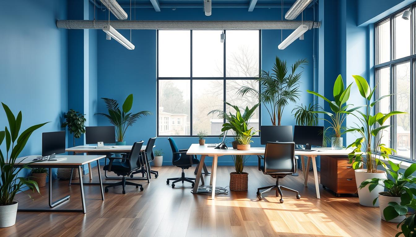
Warm and cool neutrals have different effects on us. Warm colors like beige make spaces welcoming, perfect for areas where teamwork and talks happen. On the other hand, cool tones like soft gray keep us focused, especially in private spaces for solo work.
- Warm colors go well with wood and soft fabrics, ideal for comfy meetings.
- Cool shades help keep our brains calm in rooms meant for focus.
- Adding balanced accents keeps the space interesting without being too much.
Neutral Office Colors That Boost Concentration
Choose a neutral color scheme to improve how people work. Thoughtful paint choices reduce glare, make things clearer to see, and help everyone focus without being too loud or distracting.
Soft gray and cool greige for reduced glare
Soft gray and cool greige paints help your eyes by blending into the background. They cut down on screen glare and bright lights. This helps reduce eye strain in big, open spaces.
Go Painting suggests using soft grays to protect your eyes around desks. Benjamin Moore says gray is flexible and helps keep your focus sharp, yet it looks classy.
Off-white and near-white backdrops for clarity
Choosing off-white or near-white for your office makes it look open and clear. These colors work well for notice boards, shelves, and changing displays.
Near-white is good at hiding small wall flaws and fits with different lights. Pick slight color undertones to make the area feel warm or cool, depending on your lights and furniture.
Warm beige and taupe for calm and comfort
Warm beige and taupe colors make places for teamwork and rest feel welcoming and calm. They make these areas good for longer, easy-going chats without being boring.
Benjamin Moore says warm browns create a serious yet comfortable setting. Combine them with natural wood and plants for a fresh, touchable look.
- Tip: test samples on multiple walls at different times of day.
- Tip: mix a near-white office wall with a cool greige accent for balanced contrast.
- Tip: use taupe for focus in quiet rooms, and warm beige office paint in social spaces.
How to Choose the Right Neutral Undertone for Your Office
Choosing the right neutral undertone can change the mood and productivity in an office. Start simple: test paint on several walls. See how they look throughout the day. Then, pick the best fit considering light, decor, and your brand.
Testing paint samples in real lighting
Start by putting 2–3 big paint samples on various walls. Brands like Benjamin Moore and Go Painting suggest watching these samples in morning, noon, and night light. This helps you see how colors shift.
Take photos of the samples under your office lights to compare them easily. Checking out different finishes, like matte or eggshell, is smart too. They can change how a color looks and the glare.
Matching neutrals to natural and artificial light
Natural light brings out cool tones, while some artificial lights can make colors look warmer or cooler. For example, a blue-gray might seem too chilly under fluorescent lights.
Use a mix of general and specific lighting to keep the room’s colors steady and cozy. Rooms facing north usually do well with warmer hues. But, rooms facing south suit cooler colors like greys and greiges.
Pairing neutrals with brand accents and furnishings
Neutral walls help your brand’s colors and accents pop without fighting for attention. Neutrals can help make your brand’s signs and special areas stand out more clearly.
Choose neutrals that fit your office’s style and the undertone family. Warm tones go with wood and brass, while cool ones pair with steel and muted fabrics. Pick accent colors carefully to energize or focus attention.
- Practical step: test paint samples on the same wall you plan to paint.
- Practical step: view swatches under both daylight and your task lighting.
- Practical step: align finishes and furniture to support the chosen undertone.
Practical Applications: Where to Use Which Neutral Shades
Choose neutral shades based on the room to shape mood and behavior. Small changes in undertone and finish can direct attention, calm teams, and simplify maintenance. Use the tips below to pick tones on purpose.
Private workstations and focus zones
Pick colors like soft gray, slate, or cool greige for focused work. These shades lessen glare and reduce distractions. Benjamin Moore suggests matte or eggshell finishes to decrease reflection and add depth.
Keep accents low-key. A soft blue or green on a task lamp or pinboard can refresh the mind without distraction. Always test paint samples under the actual office lights before making a big change.
Meeting rooms and collaborative spaces
Choose warm greige or soft taupe for meeting rooms to boost clear talking. These neutrals make everyone feel included and leave space for brand colors. Add a touch of yellow or muted orange on one wall for creativity.
To make zones clear, layer different neutrals. Make wall, ceiling, and trim slightly different to define spaces without noise. Pick finishes that are both durable and comfortable so everything ages well.
Break rooms and lounges
Break room colors should welcome rest and friendly chats. Warm beige, sand, and light taupe create a healing atmosphere. Choose high-sheen finishes for easy cleaning without sacrificing warmth.
Add natural touches like wood, weaves, and plants to boost peace. A matching color scheme in work and break areas makes switching between tasks smoother.
Design Details That Amplify Neutral Palettes for Focus
Small decisions in trim, wall treatment, and fixtures change a neutral office’s feel. Use targeted details for visual interest without distracting staff. Test options in the workspace to see how they look daily.
Accent walls, wainscoting, and subtle texture
Introduce accent walls in neutral colors behind desks or reception counters to create calm focus areas. A single muted wall adds structure while keeping the setting calm. Benjamin Moore suggests using accent walls wisely to enhance space and support your brand.
Choose subtle textures in neutrals, like matte paint, grasscloth, plaster, or wood paneling. These textures add depth and keep the look interesting without taking attention away from work. Use wainscoting in meeting rooms for a focused backdrop that directs attention.
Sheen choices for walls and furniture
Choose a paint sheen for office walls that reduces glare. Matte or eggshell hides flaws and creates a focused atmosphere. Eggshell is also durable for busy areas while keeping shine subdued.
Use satin, semi-gloss, or gloss for trim and cabinetry to emphasize architectural details and ease cleaning. High sheen can enhance small spaces but might show imperfections. Always test finishes in large areas first.
Lighting strategy to complement neutral paint
Match office lighting and paint by choosing light temperatures that suit your undertone. Warm LEDs are good for beige and taupe; cool LEDs work for gray neutrals. Combine ambient and adjustable task lighting to ease screen viewing.
Spread overhead light evenly to avoid glare and test paint samples under the lights you use every day. This ensures colors stay consistent and shows how they interact with light, both natural and artificial.
- Use accent wall neutrals behind focal work areas to steer attention.
- Apply texture with neutrals to add depth without distraction.
- Choose paint sheen for office walls that balances glare control and durability.
- Test office lighting and paint together to avoid color shifts across the day.
Common Neutral Color Palettes and Sample Paint Options
Picking a neutral look for your office needs a balance. Here are three practical color palettes with examples from paint brands. Plus, tips for choosing finishes that encourage focus and comfort.
Calming cool palette
Think about using soft slate gray, cool greige, and light bluish-gray. These colors can help reduce glare. They make private offices and planning rooms feel more clear-headed.
- Sample paint brands: Benjamin Moore’s Silver Satin OC-26 and Manor Blue 1627 have soft, blue-gray shades. They feel calm in daylight.
- Application tip: Use cool white trim and matte finishes with them. Add touches of subtle blue-green for a calm feel.
Warm welcoming palette
Colors like warm beige, taupe, cream, and sand offer a cozy background. They’re great for places where people come together or relax. These warm paint colors help everyone feel relaxed and welcome.
- Sample paint brands: Benjamin Moore’s Beacon Hill Damask HC-2 and Van Buren Brown HC-70 have gentle, inviting undertones. They’re great for common areas.
- Application tip: Mix them with warm wood and LED lights for a cozy vibe. Semi-gloss on furniture adds durability.
Layered neutrals for depth
Using layered neutrals means starting with almost white walls. Then, add mid-tone greige or taupe on some walls, and dark charcoal or warm brown for trims or built-ins. This method adds depth without strong color contrasts.
- Sample paint brands: Try off-whites like Benjamin Moore’s Simply White or Ballet White. Then add mid-tone greige and deeper shades like Silhouette AF-655 or Dark Linen 2147-60.
- Application tip: Spread lighter tones widely to brighten rooms. Darker trims create visual depth and foundation.
Conclusion
Choosing the right color for your office is key. It makes the space less busy looking and helps people focus better. Go for light colors like soft grays and warm beiges. Check how they look in different lights to reduce glare. This creates a peaceful setting that boosts focus at work, whether at desks, in meetings, or in lounges.
When picking paint, try out samples in both morning and afternoon light. Match paint undertones with the direction your room faces. Go for matte or eggshell finishes to keep shine down. Use bold colors sparingly as accents. Mix and match neutral shades for a layered look. This way, your office stays adaptable and true to your brand.
Trusted brands like Benjamin Moore have specific swatches to help you decide. Getting help from professional painters or color advisors guarantees a good job. A well-thought-out design proves neutral colors aren’t dull but smart. They make the office more comfortable and clear, boosting work productivity. This lets the company’s style and practical features stand out.
Content created with the help of Artificial Intelligence.