Explaining minimalist office color palettes starts with a simple plan. Pick 3–5 colors, including soft neutrals. Apply the 60/30/10 rule. This means one color is main, another supports, and a third adds pop. This guide helps avoid the pitfalls of too dull or too many colors.
How to pair colors takes thought. Start with a key item like a rug, lamp, or art piece. This ties your colors together. By varying shades within the same family and mixing textures, your office won’t feel bland. Subtle changes in color depth and materials make a big difference.
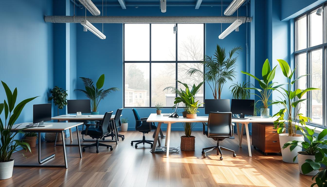
Choose colors that fit the room’s purpose and how light plays in it. For work areas, blues and greens are best. They boost focus and are easy on the eyes. Warm tones like soft gold or terracotta are perfect for meeting spots. Opt for matte finishes in paints from Benjamin Moore, Sherwin-Williams, or Behr. They help control light and keep things serene.
Then, look beyond color. Mix different types of lighting and select furniture that matches. Use built-in storage to keep lines clean. These thoughtful touches tie your office colors together. They ensure your workspace looks great without getting in the way of work.
Key Takeaways
- Limit palettes to 3–5 colors and apply the 60/30/10 rule for balance.
- Use an anchor piece to unify secondary and accent tones.
- Favor matte neutrals with varied textures and wood tones to avoid monotony.
- Match colors to function: blue/green for focus, warm accents sparingly.
- Choose durable paints from Behr, Benjamin Moore, or Sherwin-Williams.
- Plan lighting and storage to preserve a clutter-free minimalist workspace design.
Understanding Minimalist Color Theory for Offices
Minimalist color theory in offices is about simplicity. Aiming to reduce visual noise, choose a key piece. This could be a reception desk or shelves that bring colors together. Add depth with textures and architecture so that neutral tones feel dynamic.
Design recommendations lean towards 3-5 colors. These should follow a light-to-dark flow across various materials. This keeps the look unified but interesting. A single-color scheme can offer simplicity and diversity in tone.
Core principles of minimalist color
- Keep to a few coordinated tones.
- Pick an element that brings the room together.
- Use different textures, like matte metals or woven fabrics, for depth without clutter.
- Combine warm and cool neutrals to keep things calm but engaging.
How color psychology informs minimalist choices
- Studies find blue enhances concentration, making it great for meetings or teamwork areas.
- Green is soothing, perfect for places where people spend many hours working.
- Touches of soft yellow or terracotta bring life without overwhelming the senses.
- Shades of gray add a sense of space and balance the overall look.
Choosing the right finishes is key to both appearance and maintenance. The finish type influences light reflection and how marks show. Matte finishes make spaces look contemporary. Satin or eggshell are shinier and hide scuffs better in busy spots.
Match colors with the purpose of each room. Use blue for meeting areas and green for relaxation spots. Choose neutral shades for general workspaces. This approach marries office color psychology with daily operations, keeping design both functional and meaningful.
Minimalist Office Color Palettes Explained
Minimalist offices focus on simple designs to bring peace and clarity. Follow the 60/30/10 rule for colors: 60% of the room should have a main neutral color, 30% should use a secondary color, and 10% should add a pop of color or metal. Choose a main item, like a rug or art, and select 3–5 colors from it to make a plan.
Typical palette structures used in minimalist offices
When setting up colors, think about where they’ll go. Use a main neutral for walls and big furniture. The 30% should cover sofas and desks, while the 10% adds flair with items like lamps or cushions.
Find ideas by looking at real-life examples. Check out Herman Miller or Studio O+A offices for good color pairings. Mix different shades and textures to keep things interesting without being messy.
Sample palettes and where to use them
The calm focus palette is great for solo work areas and small meeting spaces. Try pale blue on walls, use off-white for furniture, and add a navy blue accent. This helps with focus and clear thinking.
The organic minimal palette is perfect for desks and lounges used a lot. Go for greige walls, light wood furniture, and green touches to ease your eyes and feel relaxed.
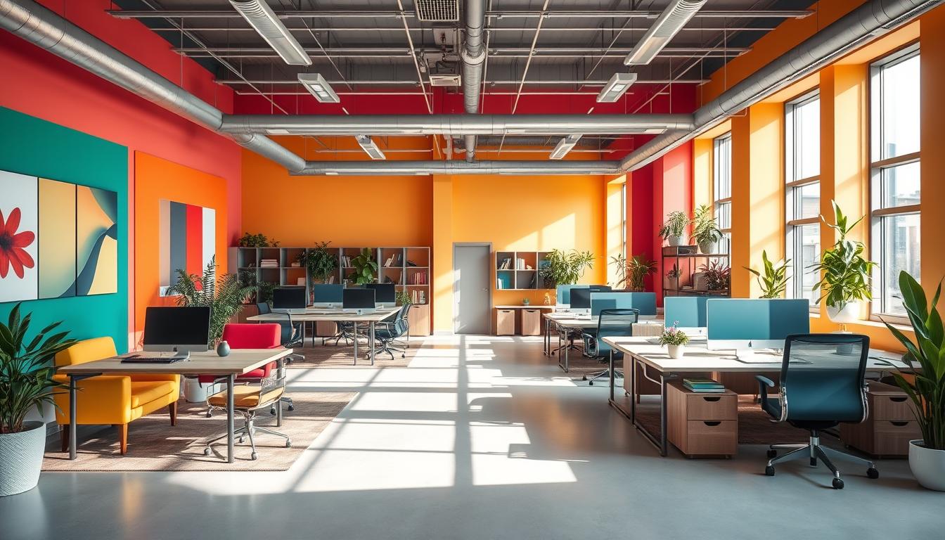
The high-contrast minimalist is best for entryways and group work areas. Begin with almond white walls, add navy features, and use matte black details for a sharp, modern look.
- Practical mix: soft gray walls (60), charcoal furniture (30), muted olive or mustard accents (10).
- Small offices: favor lighter neutrals to expand perceived space.
- Larger spaces: introduce darker feature tones to create intimacy.
Keep bright colors to the 10% to avoid getting overwhelmed. Choose blue for focus areas. Pick green to feel creative and relaxed, or use soft yellow or terracotta in collaborative spots to boost energy.
Starting with a key piece like a vintage rug or a unique lamp can help decide on colors. Choose two or three colors from it for a well-matched look in your office.
Practical Guidance on Paint, Light, and Materials
Try out paint samples at different times of day. Look for color ideas in items like a wood desk or a leather chair. This helps avoid surprises from changes in office lighting and color throughout the day.
Choose the right finish for the job. Eggshell or satin finishes are good for busy walls since they hide marks and are easy to clean. Matte finishes on accent walls or textured panels add depth. Before deciding, compare eggshell and matte under various lighting conditions.
Stick with reputable brands for their color selection and durable products. Behr, Benjamin Moore, and Sherwin-Williams have wide color options and strong formulas. Choose easy-clean options for busy spots and stronger finishes for furniture and fixtures.
- Test paint samples in situ at morning, midday, and late afternoon.
- Match storage hues to walls to keep a streamlined, clutter-free look.
- Use varied wood tones and low-profile furniture to anchor a minimalist palette.
Design lighting in layers: ambient, task, and accent. Place desks near windows to use natural light. Adjust colors based on whether the light is cool from the north or warm from the south.
Check paint colors under different lighting before choosing. Office lights affect color in unique ways. A color might change under different types of light, so always test it first.
Add texture to keep a minimalist design interesting. Mix matte walls with satin metal, wood, and leather. Small rugs and textured fabrics can add variety while keeping the look simple.
- Avoid busy furniture to maintain a clean look.
- Match upholstery and wood to wall color for a unified design.
- Pick strong textiles and finishes for busy areas to reduce wear.
Material finishes change how colors look. Matte surfaces make tones softer, while shiny finishes like satin or gloss can make colors brighter. Use this to balance the look of large and small areas.
Choose eggshell or satin finishes where marks are likely and use matte where texture is important. Combine finishes, lighting, and textures in a minimalist design for a durable, peaceful office space that’s easy to adapt.
Design Mistakes to Avoid and How to Fix Them
A minimalist office can feel calm or too plain based on simple choices. Spotting common mistakes early can save a room. The tips below focus on easy, affordable fixes for minimalist design and color mistakes, keeping things simple.
Typical minimalist color mistakes include using just one neutral shade too much, choosing only one color for everything, and adding too many bright spots without balance. These errors can make a room feel bland or chaotic. Check colors in different lighting to spot issues sooner.
To improve a boring color scheme, introduce shades that are lighter or darker. Stay in the same color family but use varied tones. Replacing one wall or a big textile with a shade that adds depth keeps the minimalist vibe.
Breaking up repetitive patterns can be done with changes in texture and materials. A woven rug, a leather chair, or different wood finishes can add subtle variety. These changes keep things interesting without adding busy patterns or loud colors.
- Bring in one soft accent color to balance brighter details.
- Use matte or satin finishes on big surfaces to reduce shine.
- Pick furniture with real wood colors instead of everything matching exactly.
Try the 60/30/10 rule to fix color balance. Use 60 percent of your main neutral shade, 30 percent as a secondary color, and 10 percent for a vibrant accent. This helps fix color scale mistakes in offices.
Follow a step-by-step plan to organize your fixes. Pinpoint the main issue, mix shades within the same color family, add different textures and woods, place one key piece to tie the room together, and adjust the colors based on the 60/30/10 rule in the actual lighting.
- Figure out if the problem is too much of the same, mismatching, or lack of a focal point.
- Add variety in tones or a single neutral accent.
- Bring in texture with rugs, fabrics, leather, or wood mixes.
- Add a piece that brings the room’s colors together in small amounts.
- Reevaluate colors in the room and adjust with the 60/30/10 rule.
When strong color is too much, tone it down or keep vibrant colors to areas like one wall or a bench. Using blues and greens in small amounts can boost focus. Soft yellows or terracotta add energy without being too much. These focused changes help avoid common minimalist design errors.
Keep storage simple and choose furniture that fits the color scheme and is comfortable. Too much stuff exaggerates color errors, while sleek design lets subtle colors and accents stand out. Often, it’s the little adjustments that make a big difference.
Conclusion
Choosing colors for a minimalist office is simple. Start by looking for inspiration and picking a few consistent colors. Make sure to choose a main piece and stick with three to five colors. Follow the 60/30/10 rule for balance. Assign one or two colors for big furniture pieces. Use the rest for soft items and decorations. Adding different shades and textures keeps the look interesting.
To design a productive space, begin with neutral colors. Add accents in soft, warm tones or cool, calming colors. Always choose high-quality paints from brands like Behr, Benjamin Moore, or Sherwin-Williams. They last longer. Choose finishes that handle daily use well. Test paint in different lights. Use both task and ambient lighting to see the true color.
Color psychology is key for a good office design. Cool colors lessen eye strain and help with focus. Small, vibrant accents add energy without causing a distraction. Keep furniture practical and storage simple for a clean, efficient area. Always test your paint and materials in your actual space. Adjust colors to match your company’s style and your team’s needs.
This guide connects style with function. A limited color set, chosen on purpose and used wisely, creates a peaceful and efficient office. Follow these steps to design a workspace that meets business requirements and boosts day-to-day work.
Content created with the help of Artificial Intelligence.