Color speaks a silent, universal language that shapes our first impressions and daily moods. Angela Wright’s research discovered that we notice color before anything else. These colors ping feelings like joy, alertness, or calmness, which then affect how well we do our jobs. By choosing the right colors for the workplace, we can improve focus, creativity, and happiness.
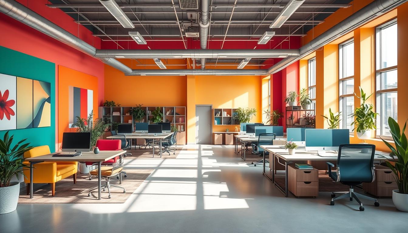
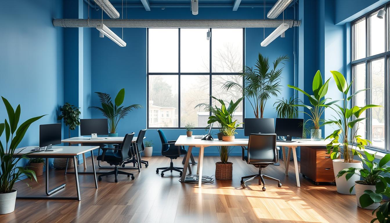
Choosing colors for the office should match the purpose of each space. For areas where concentration is key, such as meeting rooms, use blue. Green is perfect for spaces dedicated to creative work or places where people work long hours. It helps reduce eye strain and keeps everyone feeling calm. Use red and bright orange to add life to active zones, and yellow to inspire creativity in training or brainstorming areas.
To bring it all together, neutral tones and finishes are essential. Shades like off-white, warm grays, and soft beiges provide a calm background. These neutral colors allow the vibrant ones to stand out, without overwhelming the space. Brands like Benjamin Moore suggest using emeralds, mints, and muted grays to make offices more productive. Remember to consider how light reflects off surfaces, choosing matte finishes for walls to decrease glare and satin or semi-gloss for trim to add a nice contrast.
Keep office color schemes from becoming too much by having a plan. Start with a main color that fits the office’s purpose. Then, add one or two accent colors to create the right mood. Use neutral colors to tie everything together. Always test paint colors in your actual office to see how they look with the lighting. This way, your office colors will look purposeful and modern, not random or overwhelming.
Key Takeaways
- Color shapes first impressions and daily behavior; plan with purpose.
- Use blue for focus, green for long hours and creativity, and red/orange sparingly as accents.
- Neutral tones and finishes tie stronger colors together and prevent visual fatigue.
- Test paint samples under actual lighting and adjust sheen to control glare.
- Follow a simple rule: dominant color for function, accents for mood, neutrals for balance.
Understanding Color Psychology for Office Design
Color shapes first impressions and behaviors at work. Designers use color psychology to influence mood, focus, and energy. This sets the right atmosphere for clients and staff, matching the company’s brand.
Why color matters in the workplace
Color causes instinctive and emotional reactions. Blue can calm anxiety and help with focus. Green eases eye strain and boosts creativity. Red energizes and is good in active areas but can be overwhelming.
Yellow promotes optimism and creativity in moderation. Neutrals balance these effects and define spaces clearly.
How color intensity and saturation change effects
The intensity of a color affects reactions. Bright, saturated colors wake up the senses. Soft, muted tones keep focus during long tasks.
Choose saturation based on the work: analytical tasks need calmer colors, and creative ones thrive with bold colors.
Cultural and individual differences to consider
Colors mean different things in various cultures. Personal experiences also influence color response. Age and visual comfort vary by person. Use staff feedback and tests to select colors carefully.
Angela Wright’s color theory links colors to reactions. It suggests which colors suit tasks needing focus, physical activity, or emotional support. Always test colors in actual lighting. Choose finishes like matte to minimize glare. Watch how colors work at different times to ensure the right choice.
How to Balance Colors in a Modern Office
To start, assign a primary color to define the mood. Accent colors should guide the eye and add interest. Use a neutral palette to keep things calm and readable. This simple approach helps maintain consistency across rooms.
Define roles: primary, accent, and neutral
Choose a primary color that fits the room’s aim, rather than following trends. Use accent colors to highlight important areas like pathways or focal points. Neutrals like whites and grays act as a backdrop, easing visual load and making spaces seem bigger.
Choosing a dominant color by function
Pick a main color that suits the work done in that space. Blue is great for tasks requiring focus, like accounting. Green is perfect for creative teams needing a balanced environment. Use red for areas that buzz with energy and yellow or orange to encourage talking in learning spaces.
Using neutrals to tie palettes together
Neutrals make bold colors look deliberate. Choose matte paint for walls to add depth, and gloss for trims to stand out. Stick to one brand for color consistency. Always test colors under different lights before deciding.
- Functional color selection: match intensity to time spent in the room.
- Accent colors: introduce pops through furniture, artwork, or small walls.
- Neutral office palette: use it to balance bright hues and aid circulation.
By following these tips, you’ll create places where color enhances functionality. Smart material and accent choices keep the overall look balanced and effective for its purpose.
Room-by-room color strategies for modern offices
When picking designs, it’s smart to think about their purpose. Colors can help with focus, mood, and showing off your brand. We have tips for each office area. They include what paint to use, what lights work best, and how to try them out.
Workstations and individual desks
- Soft greens and blues are great for places where people need to concentrate for a long time. These colors can make it easier to look at screens for hours and keep you focused.
- Choose paint finishes like matte to cut down on screen glare. Check how it looks next to desks at different times of the day before you decide.
- You can make the space feel more welcoming with some warm-colored desk items or chair fabrics, without making it too lively.
Meeting rooms and collaboration spaces
- Calm blues on the walls help everyone think clearly and talk in an organized way. Add in some yellow or warm ochre to bring out creative ideas during meetings.
- Using a different wall color or chairs can help keep people focused without making the room too busy.
- Choose semi-gloss paint for areas that get touched a lot to make cleaning easier. But keep the wall finish soft so there’s less glare on screens.
Break rooms, cafeterias, and circulation areas
- Bright colors like orange and yellow make social spots more lively, while red helps move people along in hallways.
- Use bold colors in small parts, like on tiles or in art, to keep the bigger spaces feeling calm. This also makes it easier to change things up later.
- For areas where food is around, go for finishes that clean up easily and comfy fabrics for sitting.
Reception and client-facing areas
- Start with neutrals like white to make the space feel bigger and look professional. Add colors from your logo to make guests feel welcome without going overboard.
- A touch of black in the furniture or signs looks modern and strong, especially when mixed with wood or plants.
- Use a bit shinier paint for details to make things look nice, but keep the walls less shiny so guests are comfortable while waiting.
Selecting palettes and materials for a cohesive modern look
Start with linking colors to the office’s mood. Use neutrals on walls for calmness, with furniture and textiles for color pops. Plants add a touch of nature.
When mixing paints, furniture, and plants, think about the office vibe. Choose comfy rugs and chairs in eye-catching colors. Go for desks in wood or gray tones, and let plants bring in natural colors. This mix helps focus and relax while working.
-
Test paint and fabrics together. This shows how different textures change colors.
-
Use warm woods and some black metal for a solid, professional feel. But just a little black, so it’s not too harsh.
-
Keep bright colors for small stuff. This helps keep the room calm and pulls focus.
Think about how light plays with textures. Matte paints make rooms softer and cozier, while semi-gloss makes cleaning easier and adds definition. Mix different textures for an interesting space.
Try out colors before you decide. Paint big samples to see how light changes them. Match fabric samples to get the full picture. A quick change in decor can show if everything works together well.
-
See how different paint finishes look in daylight and under lights. This helps pick the right one.
-
Set up a small area with your fabric and plant choices. This way you can see if it all fits together.
-
Keep track of what works. Adjust your choices so the office feels right without too much going on.
Think about the future when choosing materials. Pick stuff that lasts longer for busy spots. Go for a bit of shine on trims for easy cleaning. Use textures and sheens to create a welcoming and focused area.
Practical tips to avoid common color mistakes
Good color choices make teams feel alert and calm. Start by making a simple plan. This plan should consider how colors affect people. Think about the office lighting. This ensures that painted walls and furnishings look great under real-world lighting conditions.
Avoiding color overload and visual fatigue
Don’t use intense shades for entire rooms. Saturated blues or bright reds can tire out office workers’ eyes. Instead, choose muted tones for large spaces. Brighter colors work best as accents, like on cushions, art, or signs.
Remember, different people like different colors. While some enjoy vibrant colors, others may prefer calming greens or neutral tones. Always test colors on a small area before repainting the whole room.
Balancing natural and artificial light
Natural light affects how we see colors. North-facing rooms might seem cooler and darker. South-facing ones get warmer. Choose the right paint finish based on the room’s light. Matte finishes are good for sunny walls, and eggshell or satin are better for less light.
Stay away from very dark colors in dim areas. They can make spaces feel smaller and increase eye strain. Adjust your artificial lighting to complement your color choices. This approach avoids overwhelming the room.
Adapting palettes for different working styles and schedules
Create office color schemes that fit different teams and times. Night-shift workers might like warm, bright accents. Day teams could prefer calming colors to help them focus.
- Use removable panels, modular furniture, and accent accessories to easily change colors.
- Pick finishes like eggshell or satin for busy areas, and semi-gloss for trims to simplify cleaning.
- Test various accents with teams to find ones that boost focus and productivity.
By tweaking office lighting and color, along with flexible color schemes, you avoid common issues. Regular checks and feedback help spot problems early. This keeps solutions easy and affordable.
Measuring impact and iterating on office color schemes
Before making any changes, set clear goals. Decide if you want to enhance focus, creativity, or calm. Opt for small and reversible updates to catch the team’s attention without causing disruptions. Use both emotions and facts to see if you’re on the right track.
Collecting employee feedback and performance signals
Get feedback on office design by conducting short surveys and brief interviews. Inquire about mood, how productive people feel, and their overall happiness with changes. Match these opinions with concrete data like how quickly tasks are done and the duration of meetings.
Frame your questions to connect color choices with your objectives. For example, find out if a blue accent wall helps with focus or if warm tones encourage team work. Mix anonymous surveys with optional group discussions for a well-rounded view.
Small experiments and A/B approaches
Try out A/B testing with color by painting different areas in contrasting hues. Look at hard data to compare the two. This can include how long tasks take, interruptions, and how often breaks are taken. This helps identify clear impacts.
Make minor tweaks: change the furniture, add a colorful accent wall, or play with the brightness of colors. Keep tests short and rerun them to double-check your findings. Record everything to spot trends over time.
When to call a professional
If you’re planning a big change, aligning with your brand, or dealing with tricky light, get a color consultant. They know the best paint options, like Benjamin Moore, and the most durable finishes.
For projects where access, rules, or lots of use is important, professional help is key. Design experts and paint professionals can draft previews and details. This saves time and prevents expensive errors.
- Collect feedback on mood and productivity.
- Run A/B color testing with clear metrics.
- Use an office color consultant for large or complex projects.
Conclusion
Colors affect our feelings and work habits, so use them with purpose. A well-thought-out office color scheme uses a main set of colors for daily tasks, accent colors to add life, and neutral tones to bring it all together. To stay focused and feel at ease, choose blues and greens; sprinkle in yellow or orange in areas where people come together or take breaks to energize the space just right.
Experts like Angela Wright show that choosing the right colors and saturation can make rooms work better. But it’s important to remember that not everyone sees colors the same way because of cultural and personal differences. Also, the way a color looks can change depending on lighting, what it’s on, and its texture, so think about how everything from paint to plants will look together.
Always test colors in the actual space and under the lights you use. Pick finishes based on the room’s needs—matte or eggshell for large walls, and semi-gloss for details and furniture. Start with well-known paint palettes and brands, then tweak based on what works and what people think. When you really need your office colors to match your brand and last a long time, talking to a color expert is a smart move.
Content created with the help of Artificial Intelligence.