Picking the right paint can transform your work experience. This guide is all about the top Wall Colors for Remote Work Setups in U.S. homes. You’ll learn about home office colors that improve focus, comfort, and look great on camera.
The type of paint can influence how you feel and work. Benjamin Moore suggests choosing a color that makes you feel relaxed and ready to tackle tasks. This article connects color psychology with tips on lighting, paint finish, and room layout to help your space encourage focus or creativity.
We dive into the science and practice of selecting remote work office and productivity colors. You’ll find specific advice from brands like Benjamin Moore, Sherwin‑Williams, and Farrow & Ball. We’ll talk about choosing colors for the whole room, adding accents, and testing paint samples at various times.
Need subtle colors for video calls or vibrant ones for creativity? This part helps set up a workspace that is professional, cozy, and aligns with your job.
Key Takeaways
- Wall color greatly affects mood and productivity in home offices.
- Benjamin Moore, Sherwin‑Williams, and Farrow & Ball offer trustworthy choices and trending palettes.
- Think about lighting and paint finish when picking colors for your space.
- Choose full-room colors for unity and accents for added focus or warmth.
- Try out paint samples at different times to choose the best office colors for remote work.
How paint color affects mood, focus, and productivity
Choosing the right wall color for a home office impacts your feelings and work. Colors interact with light and the surface’s finish, along with your tasks. This guide helps match colors and finishes with your needs, aiming for a room that boosts focus and wellbeing.
Color psychology and cognitive effects
Blue hues help calm your mind and support deep focus. Light blues make a room feel open, while darker blues like navy or slate provide a sense of seriousness for focused tasks. Green tones ease eye strain and give constant energy, useful for long work sessions.
Neutral colors like grays, off-whites, and beiges reduce distraction and create a professional look. Adding warm colors like yellow or coral in small amounts can boost creativity in team areas. Dark shades offer a sense of privacy and impact, especially with the right lighting.
Experts, such as Benjamin Moore, suggest colors that encourage calmness and focus. Their top choices include Guilford Green, High Park, Del Mar Blue, and Blue Danube. These colors positively affect attention and mood.
Lighting’s impact on color perception
The direction and brightness of light can alter how a paint color looks. Colors in south- and west-facing rooms feel warmer, while those in north-facing rooms seem cooler. Testing paint samples at various times shows how colors change throughout the day.
The type of artificial light also affects how we see colors. Warm lights enrich warm colors; cool lights make blues and greens stand out. Good desk lighting ranges from 500–1500 lux, based on the task and your age.
It’s important to match your lighting with your paint color to avoid unexpected results. Small paint samples can show true colors under your room’s lighting conditions.
Sheen and material considerations
The finish of the paint affects the color’s appearance and its maintenance. Matte finishes lower glare and add depth, perfect for walls. Eggshell is great for offices because it has a slight shine and is easy to clean.
For trim, doors, and cabinetry, choose satin, semi-gloss, or gloss to create contrast and detail attention. Benjamin Moore’s Advance® High Gloss is great for furniture needing durability. When choosing paint finishes for an office, consider how much contact and cleaning it will need.
Picking the right finish also plays a role in productivity and color perception. Walls with low sheen seem softer and less distracting. Use high sheens carefully to draw attention to architectural details and organize the space visually.
Best Wall Colors for Remote Work Setups
Choosing the right colors can make your home office better for work. They bring the perfect mix of focus, comfort, and a look that’s good on camera.
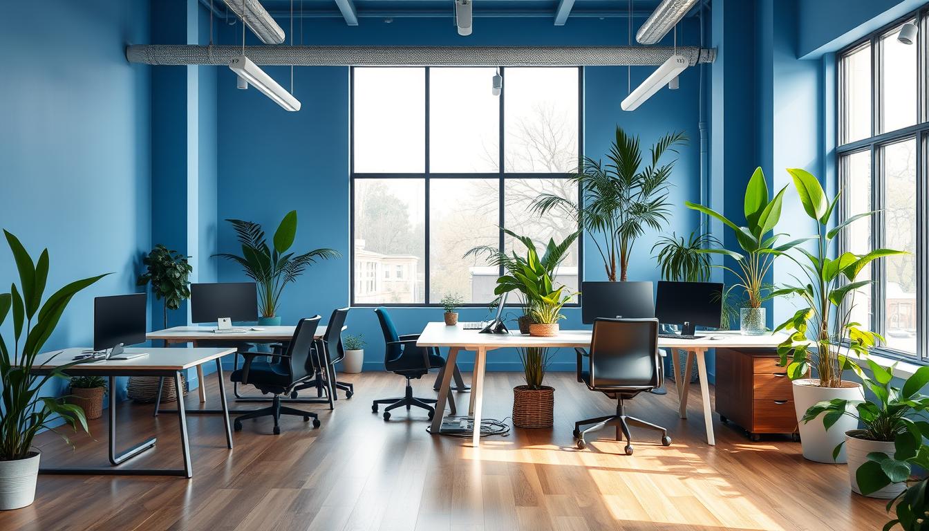
Blue shades for calm concentration
Blue shades help clear your mind and are good for thinking tasks. Popular picks like Van Deusen Blue and Woodlawn Blue are deep yet not distracting. Put these colors behind your desk or as a meeting background to look professional and focused.
Green shades for steady energy and reduced eye fatigue
Green tones are easy on your eyes and help you pay attention longer. Colors like Guilford Green and Cushing Green make your space calm yet productive. Use green in places where you create or to keep feeling balanced all day.
Neutral grays and off-whites for flexible, professional backdrops
Gray and soft off-whites work well with many room styles and light changes. Choices like Repose Gray or Ballet White are great for video calls. They also help in rooms used for various things.
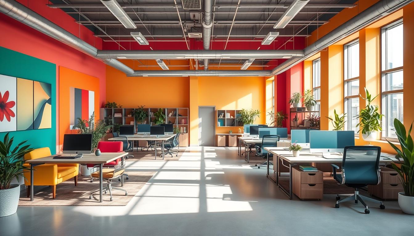
Warm accents for creativity and warmth
Touches of coral or peach can make you feel good and think together. Colors like Sunlit Coral or Butter Up make creative areas lively but not too busy. Use these warm colors on a single wall or furniture pieces to show your style.
Dark tones for drama and privacy
Dark colors like Onyx or Inkwell are best for private, focus zones in bright rooms. Dark walls add contrast and highlight light furniture. Dark shades are good for media rooms or certain wall areas to define the space.
- Pair blue paint for home office with warm wood furniture for balance.
- Combine green office paint with plants to extend the calming effect.
- Use gray home office paint as a base and swap accent wall colors seasonally.
- Reserve dark office paint for rooms with abundant natural or layered lighting.
How to choose and apply colors for your specific remote work setup
Match colors with your work type and the room’s function. Use calm blues, soft greens, or gentle grays for focused tasks. For creative areas, try warm yellows, corals, or peach. Divide a room into different areas with colors, like a sage green for work and soft yellow for relaxation.
Choose colors that look good on video for client meetings. Go for camera-friendly neutrals or deep colors to make you look better on screen. Deep navy or warm neutrals are perfect for a professional look.
Test paint in different lights. Put big samples on walls, near furniture, under the lights you’ll use. See how they look in morning light, noon sun, and evening lamp light. This helps you see how light changes color perception.
Use big stickers or small paint cans to test colors with your room’s decor. Check colors next to desks, rugs, and shelves to make sure everything matches well.
Create a unified look with accent walls and painted trim. Use a bold color on one wall for energy while keeping the rest neutral. Choose colors like rich Peruvian Chili or Delft blue for personality.
Paint trim and woodwork in bright or warm white to outline the room. Use satin or semi-gloss on trim for shine and durability. High-gloss finishes are great for furniture that needs to stand out and last longer.
The size of your room and ceiling should influence color choices. Light colors make small rooms feel bigger, and deep shades add coziness to large rooms. Use matte to make walls seem further and light colors to enlarge a small office.
For small offices, pick light blues, grays, or warm whites for a spacious feel. Add interest with two-toned walls or chair rails to make the room interesting without feeling smaller.
To make ceilings seem higher, paint them slightly lighter than the walls. Use bright white for the highest lift. In tall rooms, a darker ceiling adds warmth, especially with good lighting.
- Match color to work type and zones: calm shades for focus, warm tones for creativity.
- Test paint samples at different times and next to key furniture pieces.
- Use accent wall strategies and contrasting trim to add structure and personality.
- Choose paint for small office and apply ceiling height paint tips to improve scale.
Paint brands, popular color picks, and finishing touches
Testing samples and using brand codes ensures you get the color you want. Professionals often suggest certain colors for work areas. Brands like Benjamin Moore, Sherwin‑Williams, and Farrow & Ball have great options for home offices and studios.
Popular professional picks and brand examples
- Try these Benjamin Moore colors for your home office: Slate Teal 2058‑20, Manor Blue 1627, and many more.
- Designers love Sherwin‑Williams office colors like Inkwell, White Sail, and Rosemary.
- Farrow & Ball’s De Nimes, Card Room Green, and Dead Salmon are great for on-camera settings.
Recommended sheens per surface
- For walls, matte or eggshell finishes work best. Eggshell is durable and easy to clean.
- Choose satin, semi‑gloss, or gloss for trim, doors, and millwork. They highlight details and are easy to clean.
- High‑gloss or Advance® High Gloss is best for frequently used furniture. Use semi‑gloss or satin for less used items.
- Mixing sheens, like matte walls with satin trim, adds visual interest and depth.
Lighting, décor, and camera‑ready styling
Use both ambient and task lighting to make sure colors look right on video. Paint colors match well with the right bulb color temperature: warm lights for warm colors, daylight bulbs for cool colors.
Match wall color with your furniture and fabrics for a unified look. Use natural wood, leather, and plants with brown and green shades. White trim makes deep colors pop and helps with camera focus.
Choose paint colors for video calls that enhance skin tones and reduce glare. Dead Salmon, soft neutrals, and mid‑tone blues and greens are great choices.
Steer clear of glossy finishes in your video area. A well-painted wall, neat shelves, or art can enhance your video background. Always test paint colors with your camera setup to ensure it looks as expected.
Conclusion
Choosing the best wall colors for remote work is all about what works for you. Blues and greens are great for focus and keeping your eyes relaxed. Neutrals and off-whites offer a clean look for video calls and working with others.
Adding warm colors can spark creativity. Dark shades can make your space private and dramatic when you need it.
When picking paint, try samples in your room during the day and night. Choose matte or eggshell for walls and semi-gloss for trim. Use color on walls and furniture to mix excitement with peace.
The room’s lighting and setup are as important as the color. Match your colors with good light and a comfy layout for the best effect.
For quick choices, go with trusted paint brands like Benjamin Moore, Sherwin‑Williams, and Farrow & Ball. Consider colors like Slate Teal, Del Mar Blue, Repose Gray, or Butter Up.
This guide connects color theory with actions so your home office looks good on video. Add good lighting, a comfy setup, and camera tests to make a remote workspace that boosts work, comfort, and looks professional on camera.
Content created with the help of Artificial Intelligence.