Color talks to us without using words. It makes us feel and act differently as soon as we enter a room. Studies, like those by Angela Wright, tell us colors can make us feel happy, calm, alert, or cautious. These feelings affect our first impressions and how we act, even before any work starts.
In the U.S., choosing the right paint color for your workspace can really change how you feel, how satisfied you are, and how much you get done. A boring gray room might make you lose interest, but the right colors can boost creativity, focus, and how customers see us. This piece looks at colors that help with getting more done and talks about how small changes in paint, finish, and light can affect our work every day.
We’re going to talk about important colors: blues help with focusing, greens make things balanced and are easy on the eyes, yellows and oranges bring out optimism and teamwork, reds give energy but should be used less often, and neutrals or grays are versatile. We’ll go into how strong a color is, how pure it is, mixing colors, and the type of finish so you can pick the best combination for any work space.
The purpose of this guide on office colors is to give practical, fact-based advice for offices and home workspaces in America. It gives clear instructions on how to make work areas better with the right colors, finishes, light, and materials. This way, everyone can concentrate more and do their best work.
Key Takeaways
- Color affects first impressions and instinctive responses—choose palettes that support desired behavior.
- Best office colors for focus and productivity include blues, greens, selective yellows/oranges, red accents, and neutral bases.
- Office color psychology is most effective when combined with proper lighting, finishes, and material choices.
- Workspace paint color intensity and saturation should match task type: muted tones for focused work, brighter accents for collaboration.
- This productivity-enhancing colors guide is designed for practical application in U.S. offices and home setups.
Why Color Psychology Matters in the Workplace
Color grabs people’s attention first when entering a room. Studies, like those by Angela Wright, show it deeply affects trust and safety feelings. Using these insights, office designs can create the right atmosphere even before anyone speaks.
How humans register color and first impressions
Vision prioritizes color, letting us process scenes quickly. It hits us before shape or texture, carrying signals without words. This rapid perception can instantly signal a space’s vibe, be it professional, cozy, or sharp.
Designers and brands harness this power to shape behavior. For example, using cool tones in an entrance can make it feel calm and trusty. Meanwhile, vibrant colors can signal creativity or urgency.
Behavioral and emotional effects of color on productivity
Colors affect our mood and concentration. Blue, for instance, can enhance focus and clear thinking. Green eases stress and is good for long creative sessions.
Yellows and oranges uplift spirits, making them great for teamwork areas. Red can energize and is useful for tasks needing quick action. By choosing wisely, spaces can inspire either relaxed focus or active engagement.
Intensity, saturation and combinations matter
The shade and saturation of colors have big impacts. A bright blue might invigorate, while a soft grey-blue calms. It’s all about how color choices either support concentration or cause distraction.
There’s no one-size-fits-all color. Light and surroundings can alter how a color feels. A good tip is to use soft colors widely and brighter ones for accents.
Best Office Colors for Focus and Productivity
Choosing the right colors is crucial for work environment. It impacts mood, comfort, and how well people work together. Here are some choices and tips for design teams and managers to use right away.
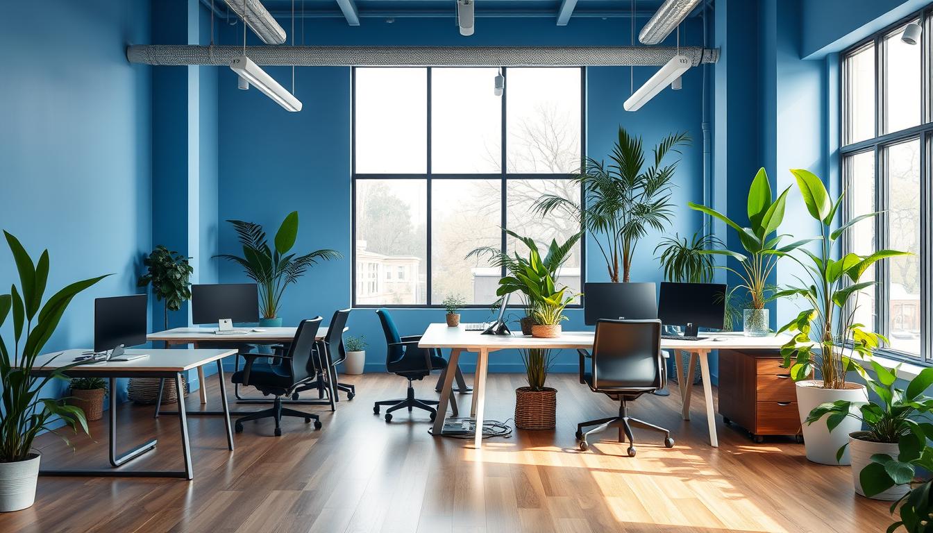
Blue for concentration and mental clarity
Blues can calm you down and help you focus. Use blue in areas where people need to concentrate. This includes libraries and meeting rooms where attention to detail is key.
Add blue touches like desk dividers or wall art. This helps with thinking but doesn’t overpower the space. Pairing blue with wood can add a warm feel to the office.
Green for balance, creativity, and reduced eye strain
Green is soothing and can ease the strain on your eyes from screens. To encourage creative thinking, incorporate green. You can do this with plants on walls, comfy green furniture, or soft green paint around workstations.
Green is great for relaxing areas where people come up with new ideas. Places with green elements, like in Brussels and Seattle, notice less stress.
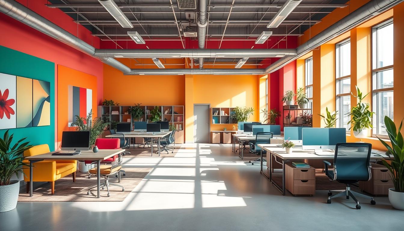
Yellow and orange to boost optimism and co-creation
Using yellow can make people more curious and uplift their spirits. A splash of yellow in a small spot can make everyone think more brightly.
Orange encourages friendly talks and joint idea-making. It works well in brainstorming areas and casual spots. Try adding orange in chairs, pillows, or one wall to help with creative sessions.
Red as an energizing accent for action-oriented spaces
Red can rev you up and make you feel more urgent. But, keep red details minimal to prevent overdoing it.
Add a few red items in places like the cafeteria or hallways. They should be places that benefit from quick decisions and energy. Opt for art or small signs rather than painting everything red.
Neutrals and grayscale for balance and flexibility
Neutral tones offer a flexible background for splashes of color. Whites and creamy colors make spaces feel bigger and brighter.
A grayscale look keeps an office looking sharp and well-arranged. Choose mid-tones for walls and darker shades for sturdy surfaces. Then, change out colorful accents with the seasons.
- Use accents to test color choices before committing to full repaints.
- Pair color with textures and plants to amplify desired effects.
- Limit intense hues to focal areas to protect concentration and comfort.
Practical Design Tips: Combining Color, Light, and Finish
Good design finds the sweet spot between boldness and restraint. It’s about energizing work areas without overwhelming them. Testing your ideas in the actual space helps. You can see how light and daily use affect your choices.
Choosing accent walls and color blocking to avoid overstimulation
Use bright colors on just one wall or within specific panels for impact without tiring the eyes. Office accent walls add energy. But they keep most spaces neutral for a calm environment.
In a color blocking layout, a wall, some furniture, and a piece of millwork share an accent color. This approach creates harmony. And it reduces visual overload.
Match color with lighting and natural light direction
The direction of natural light changes how colors look. South-facing windows make colors warmer, while north light keeps them cool. Check your colors in the morning and late afternoon to understand these shifts.
Match warm paint colors with warm lights. Cool greens and blues go well with neutral or cool lighting. Test your lighting with your paint colors to avoid unwanted surprises.
Selecting the right sheen and finishes
Matte finishes cut down on glare and add a sense of depth to feature walls. Eggshell is good for general walls because it’s durable and has a bit of shine. For areas that get a lot of handling, like trim and doors, use satin or semi-gloss for easier cleaning.
When it comes to cabinetry and metalwork, high-gloss options stand out and hold up well. Think about how the sheen of your paint will work across the whole office. This ensures consistent lighting and texture effects.
Material and plant integrations to amplify color effects
Mix in natural materials to complement your color choices. Warm woods lessen the impact of strong colors. Fabrics and carpets bring in texture that changes the perception of paint in a space.
Adding plants introduces vibrant, living elements and natural benefits. Echo your key colors with planters and accessories. This lets you update your color scheme without needing a new paint job. Pairing materials and plants thoughtfully can make the workspace more comfortable and help people concentrate better.
- Keep bright colors to just 10–20% of the room to keep things balanced.
- Test your color samples around desks to see how they look under work lights.
- Coordinate your furniture finishes and fabric choices with your main color theme for a unified look.
Room-by-Room Color Recommendations for Maximum Productivity
Choose colors with purpose for each space’s unique function. You’ll find practical color schemes and simple design tips here. They help make every room boost productivity for both teams and guests.
Workstations and individual desks
- Pick muted blues and soft greens to ease anxiety and reduce eye strain during long work hours.
- For workstations, choose colors for low walls or desk panels. Combine them with neutral backdrops like warm gray or off-white.
- Adding task lamps and potted plants can soften contrasts and help with focus.
Meeting rooms and collaboration spaces
- Paint main walls with medium blues to encourage trust and clear thinking in discussions.
- Add touches of energetic yellow or orange in one wall or seating areas to ignite creativity.
- Try subtle color schemes to keep everyone engaged without feeling too stimulated.
Creative studios and design areas
- Use green and muted yellow as main accents to boost creativity and rest the eyes.
- Introduce bright accents like coral or sunny yellow on movable items or pinboards for inspiration.
- Consider using radiant emeralds or sweet mint, as brands like Benjamin Moore suggest, for a fresh look in creative spaces.
Break rooms and cafeterias
- Opt for warm accents—muted red, orange, or yellow—to energize and encourage social interaction in eating areas.
- Apply break room color psychology: vibrant hues near eating zones and neutral walls to reduce fatigue.
- Use red in small amounts to stimulate appetite without overpowering the space.
Lobbies, open lounges, and reception areas
- Begin with neutral colors like white, off-white, or light gray to make welcoming, professional spaces.
- Add accent colors that convey your brand’s tone—blue for trust, green for peace, yellow for friendliness—in furnishings or artwork.
- Choose durable colors and finishes for the lobby to handle high traffic yet remain inviting.
Conclusion
Thoughtful color picks change the way a team works. Using blue sharpens focus. Green reduces eye strain and boosts creativity. Yellow and orange brighten moods and help with working together.
Red, used less, adds energy. Neutrals bring balance. These colors make up a guide for modern offices.
To raise productivity, choose soft main colors. Bright colors should just be accents. Test paint in your light to see how it looks. Choose finishes that are easy to maintain and fit the space’s use.
Add plants and materials to enhance the color’s impact.
Start by testing small paint areas. Plan colors for different rooms like workspaces and lounges. Use trusted brands like Benjamin Moore for picking shades.
Using these tips helps the office support well-being, creativity, and work efficiency. It also gives clear painting tips for team leaders or those in charge of the space.
Content created with the help of Artificial Intelligence.