Lighting plays a huge role in our lives. The right light color can make us more attentive, improve our mood, and spark creative thoughts. Studies in Frontiers in Psychology have found that colors and light affect how we feel, think, and stay alert. This piece provides useful tips on the top light colors for focus and creativity at work and home in the U.S.
Light and interior design work together to influence our feelings and productivity. From the colored glass of Gothic churches to bright, modern studios, colors and brightness have always played a part. Nowadays, with LED lights and RGB systems, we can easily change our lighting, making spaces more suited to our needs.
We’re here to give you a quick guide on choosing the best lighting colors. This includes the hue, color temperature (Kelvin), brightness, and where to place lights in a room. We’ll discuss how to balance light for work and rest, give advice for different rooms, and note how to use light healthily before bed.
Expect to find tips linking lighting to better work results and advice on using technology to enhance focus and creativity.
Key Takeaways
- Color of light affects mood, alertness, and cognitive performance, making hue selection a tool for productivity.
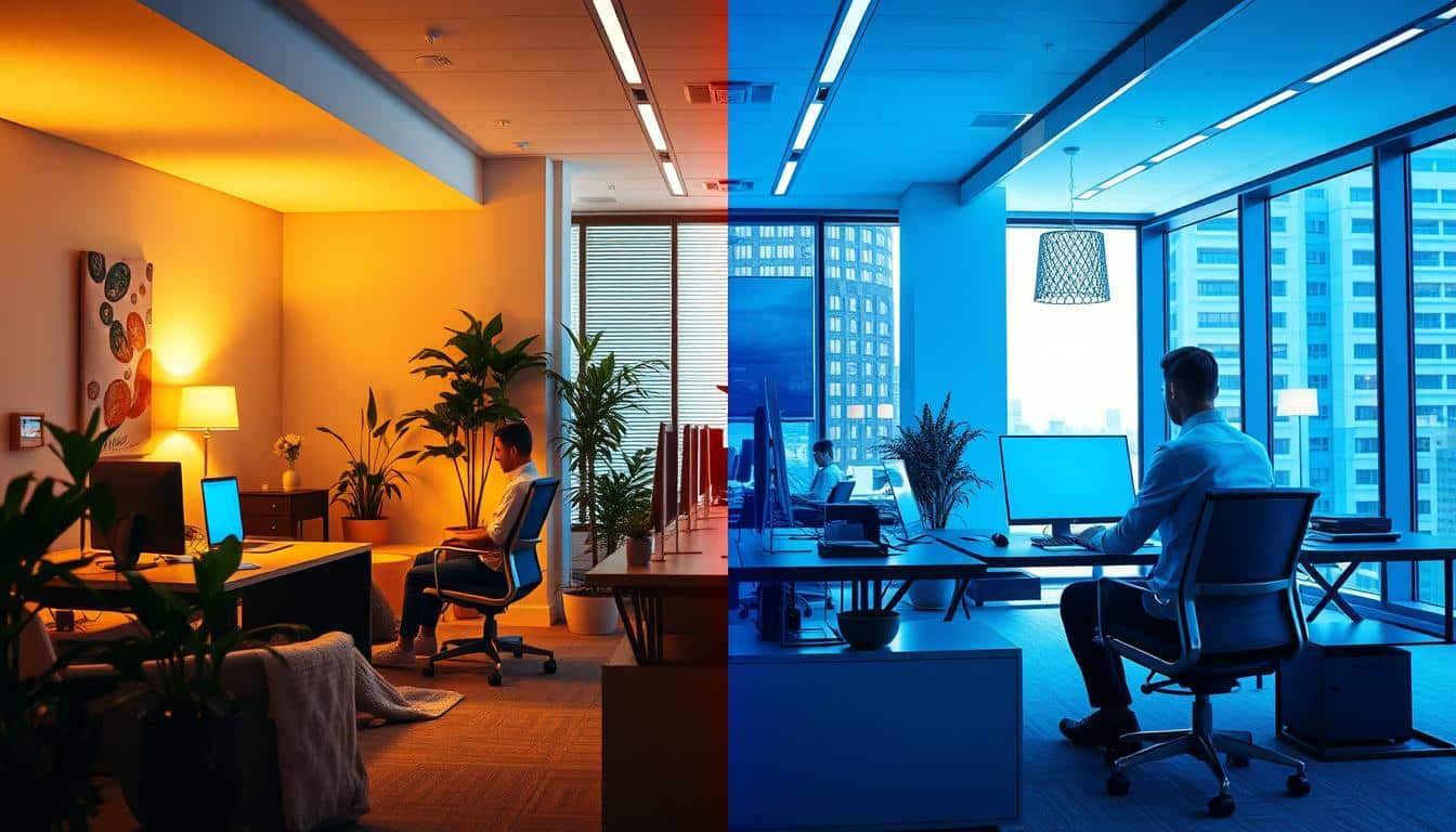
- Cooler, higher-Kelvin light often supports focused work; warmer tones can aid relaxed, creative thinking or winding down.
- LED, RGB, and RGBW fixtures enable flexible creative lighting hues and energy-efficient control for varied tasks.
- Zoning and layered lighting combine task, ambient, and accent light to balance focus and inspiration.
- Reduce blue-enriched light before sleep to protect circadian health while using brighter, cooler light during active hours.
How light color theory differs from pigment color theory
Light and pigment don’t follow the same rules. Visible light is made of different wavelengths that we see as colors. Red, green, and blue are the primary colors for blending light. When mixed, they make other colors and white. Pigments, on the other hand, remove wavelengths. This process uses cyan, magenta, yellow, and black, which we see in printing.
Knowing the difference is key for designers choosing lights for rooms. A maroon wall looks vibrant under a warm lamp. But, light doesn’t match pigment shades directly. RGB and CMYK show us that light can’t copy all pigment colors. This is why lighting changes how we see color and texture, maybe more than new paint does.
Light impacts how materials look and the ambiance of a space. White light around 4000–5000K makes details pop. Warm white light feels cozy and softens edges. Cool white light keeps us alert but might mess with our sleep if used late. Our culture and biology play roles in how we react to light, too.
Now, technology lets designers have more control. They can adjust LED colors, dim lights smoothly, and use timers. With RGB lights, mixing red, green, and blue makes many colors. Adding white to RGB makes colors look more true and whites brighter, as explained in discussions about RGBW lighting.
- Basic science: visible spectrum light vs pigment absorption.
- Design impact: light alters perceived color, finish, and mood.
- Tech tools: LED color control and smart systems enable zoning and circadian-friendly shifts.
Psychology of light color: how hues affect mood and cognition
Colors influence how we feel and think. Designers and psychologists use light colors to change emotions and actions. A lamp’s color can calm a room or make it easier to focus.
Warm colors and arousal: red, orange, yellow
Red makes us more alert and quick. It’s good in small amounts for exciting or romantic spaces. But too much red can make us anxious, so it’s best in moderation.
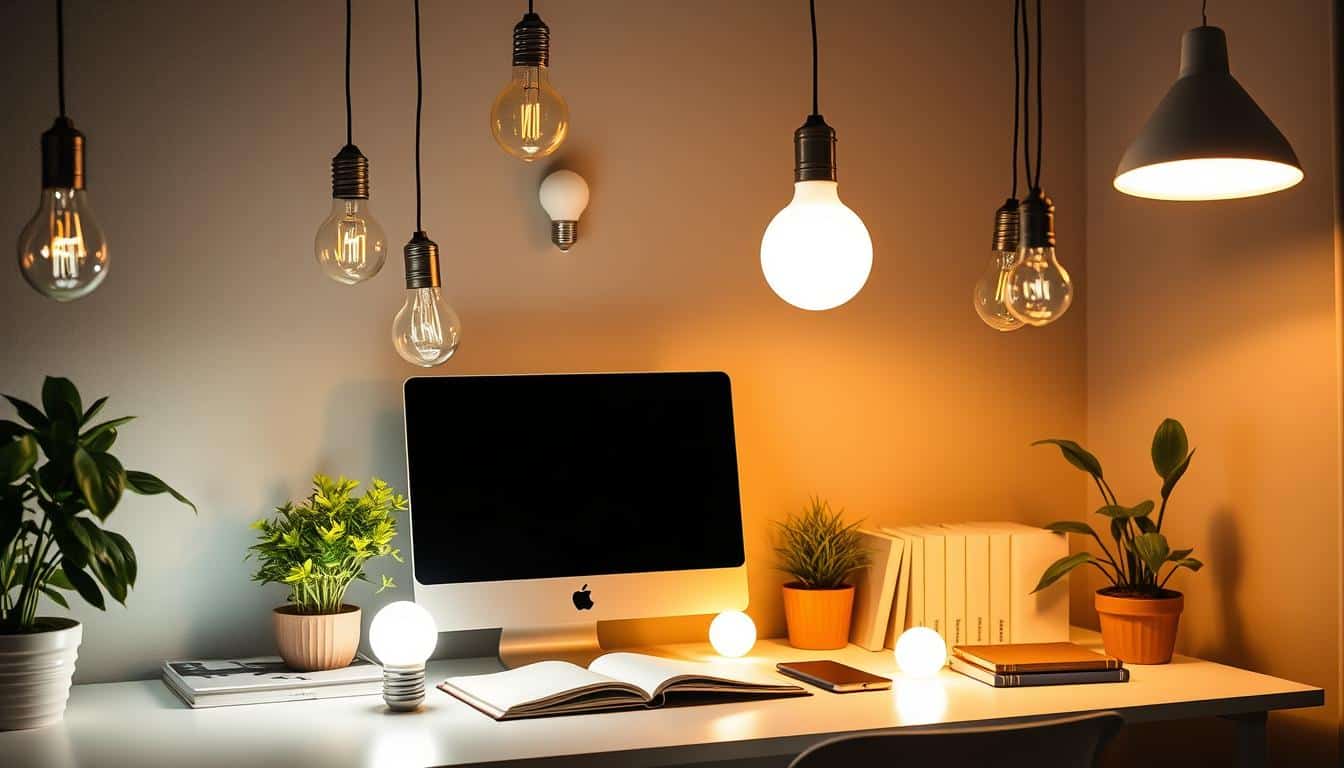
Orange and amber bring a cozy, sunset feel. They make spaces like restaurants feel inviting and disturb sleep less. This is why these colors are popular there.
Yellow boosts happiness and sharp thinking. It’s great for inspiring creativity and friendship in shared workspaces. Use yellow for specific lights, not everywhere, to prevent feeling overwhelmed.
Cool colors and calm focus: blue, green, purple
Blue helps us stay calm and focused. This makes it a favorite for offices and libraries. But using blue light at night can mess with sleep because it stops melatonin production.
Green reduces eye strain and brings balance, supporting deep focus. It’s good for long tasks and doesn’t cause the negative effects that bright white lights do.
Purple sparks creativity and feels luxurious. It’s perfect for creative studios or quiet spots, adding to the atmosphere without overpowering it.
White light and color temperature (Kelvin) effects
White light’s warmth or coolness affects our moods. Warm white feels cozy, while neutral white is crisp and aids in seeing clearly.
Cool white keeps us sharp and attentive but too cool can disrupt sleep. Choosing the right Kelvin for a space is key to the mood.
Bright lights and high CRI LEDs make everything clearer. Matching the brightness and color quality to the task helps keep everyone comfortable while working well with light color psychology.
Best Lighting Colors for Focus and Creativity
Choosing the right lighting colors helps teams move from deep focus to creativity. It’s important to match lighting with the task, mood, and purpose of a room. Here, color temperature, accent colors, and control options are key for everyday use.
Colors to use for focused work
Cool white light, between 4000–5000K, keeps you alert and focused. It’s perfect for places where details matter, like offices and kitchens.
Green accents help lessen eye strain and tiredness during long work periods. Mixing green with neutral white light creates a comfy yet alert environment.
Using neutral colors, like off-white, helps avoid distractions. Add focused lighting from high-quality desk lamps for the best visibility and color accuracy.
Colors to boost creative thinking
Yellow and amber shades inspire hope and new ideas. They’re great for spaces where creativity flows, like meeting rooms.
Orange lighting encourages talking and teamwork. It’s best used in areas where people gather to share ideas.
A hint of purple can spark the imagination. Use it as a background light in creative studios to inspire without distracting.
Red is great for short-term energy boosts, like during presentations. But too much red might be too intense for long creative sessions.
Zoning and layered lighting strategies
Assign different areas for quiet and group work using specific lighting colors. This makes it easy for people to find their ideal workspace.
Well-planned lighting zones offer flexibility. People can change settings to suit their work, balancing focus and creative lighting as needed.
Practical guidance: choosing color temperature, brightness, and placement
This color temperature guide will help you match light to each task. For daytime work, use neutral to cool whites between 4000–5000K to stay alert. Use lights above 5000K for short periods during detailed tasks to avoid harming your sleep cycle.
Use warm white or amber lights under 3000K in the evening to promote sleep. Features like dimmer switches, scheduled lighting on systems like Philips Hue or LIFX, and amber-tinted bulbs create a gentle shift from day to night activities.
For creative times, mix softer general lighting with colorful highlights. Add touches of yellows, oranges, or purples to inspire ideas, but keep your main work area well-lit for focus.
Keep your eyes comfortable by controlling brightness and contrast, and avoiding glare. Choose high-CRI LEDs from Cree or Sylvania to keep colors true and reduce eye strain. Make sure ambient and task lights are balanced to avoid one being too bright.
Use frosted shades or ceiling bounce to soften direct light. Adjust task lamps to avoid screen reflections and maintain moderate contrast to ease eye strain.
- Position task lamps to the side and just above your work area.
- For left-handed people, place lights on the right; right-handed people should place them on the left.
- Angle your task lights to reduce shadows and avoid glare in your eyes.
Ergonomic lighting enhances comfort and mood. Overhead fixtures should spread light evenly; wall-washers and uplighting soften shadows and make spaces feel larger. Place accent LEDs behind monitors or on shelves to define spaces without distracting.
Introduce small green or blue accents near work areas to lessen eye fatigue and maintain focus. Save warm tones like reds, oranges, and yellows for shared spaces or to energize group activities.
Adjust task lighting to suit the work you’re doing. High lux is needed for detail-oriented tasks; moderate lux works best for reading and brainstorming, especially with rich color accents. Always test lighting setups in your space and adjust to eliminate glare and ensure good visibility.
Room-by-room recommendations for homes and offices
This room-by-room light guide is handy for setting up different spaces. It helps you choose the right color temperature, brightness, and mood for every activity. The tips aim to make each room both comfortable and creative, reflecting your unique style.
Home offices and study rooms
- Pick neutral to cool white light, between 4000–5000K, for desks and reading spots. High-CRI LEDs make colors on screens and printed stuff look real.
- To ease your eyes, add touches of green or natural light. This can lessen strain during long work hours and keep you focused and calm.
- For the evening, set up dimmable warm lights (2700–3000K) near your bed or in close areas to cut down blue light at night. Arrange lamps so they don’t glare on your screens.
Creative studios and brainstorming rooms
- Keep a base layer of neutral white light so you can see clearly during hands-on work.
- Use colors like yellow, orange, or purple in lights to help come up with new ideas and change the creative mood quickly.
- Adjustable RGB or RGBW lights can set the scene for energetic teamwork or calm thinking.
- Divide the room into areas for teamwork with warm lighting and spots for detailed tasks with cooler or neutral lights.
Shared workspaces, meeting rooms, and lounges
- Ambient light in neutral white is great for shared desks. Pair with personal lamps for more control. Blue or green lights work well for quick breaks.
- Meeting rooms should have neutral white light for serious meetings and presentations. Warm, adjustable lights can make the space feel more inviting for laid-back brainstorming.
- Choose warm amber or orange lights in lounges to boost socializing and appetite. Dimmable lights create a cozy feel in these spaces.
- Lighting can also highlight your brand. Use signs, textured panels, or colors that match your corporate style, adding both function and flair.
This guide works for both homes and business places. Adapt these ideas to fit your space, the people using it, and the type of lighting areas you’re planning.
Health, productivity, and circadian considerations
Light affects how we sleep, focus, and our eyes’ comfort over time. Smart lighting solutions and good habits help. They minimize harm and boost how well you do during the day. Use lighting that matches what you’re doing, when you’re doing it, and your personal likes.
Protecting sleep: reduce blue light before bedtime
It’s known that blue light affects our sleep. Using cool-white LEDs over 5000K and long screen times at night can mess with sleep. They trick your brain into thinking it’s daytime. Use warmer lights under 3000K in your bedroom to prevent messing up your body’s clock.
To sleep better, try using less screens an hour before bed. Turn on blue-light filters on gadgets, and set lights to dim and warm up automatically at night. Amber lamps next to your bed are great for reading without keeping you up.
Eye health and reducing mental fatigue
To keep your eyes healthy, light should be even and bright enough, with natural colors. Too much contrast and glare can make you squint and feel tired. Pick lights that don’t reflect off screens and feel comfortable to use.
Using green or soft-white light is usually nicer for your eyes during long tasks. Bright, cool light can make you more alert in the morning. But, don’t use it too much to avoid stress and tiredness.
Individual differences and cultural factors
Everyone reacts to colors differently because of their unique biology, past experiences, and what they prefer. For example, red might make some people feel energetic and others anxious. Letting people adjust their own lighting, like with dimmers or lighting apps, means they can make it work for them.
The colors used in a workplace can impact how comfortable people feel and how well they connect with the brand. Using consistent colors helps, but being flexible is also key. Making choices that acknowledge diversity and personal choice boosts happiness and productivity in teams.
Conclusion
Lighting color can greatly improve focus, creativity, mood, and health. Cool and neutral whites make us alert and help with detailed work. Green tones can create balance and lower eye strain. Warm colors like yellow and orange boost creativity and relaxation. Purple and red are good for accents but should be used less often. This shows how different lighting colors can change our behavior and performance.
To use lighting well, combine ambient, task, and accent lighting. Set up zones for different activities and choose LED or RGBW lights for more options. Make sure the light’s color and strength are right for the time of day to keep a natural sleep cycle. This approach helps when organizing home offices or shared work areas.
To keep healthy, lower blue light at night and use warm lights in the bedroom. Letting people adjust their lighting respects individual and cultural preferences. Focusing on lighting that’s good for humans helps maintain sleep patterns. It also boosts focus and creativity at home and at work.
Content created with the help of Artificial Intelligence.