Color influences both mood and purpose in any workspace. In settings from San Francisco startups to Chicago law firms, the wrong color or too much brightness can raise heart rates. It makes people feel uneasy. This piece delves into frequent workplace color errors and their connection to stress. It aims to help leaders and designers choose better.
How people see color varies. A green wall might calm one person but bring back bad memories for another. This means what works in a lobby may not fit a quiet work area. Experts, including psychiatrists and color consultants, caution that certain large color areas tend to stress people out. This is even when those colors might work well in small doses.
We sought advice from specialists in color psychology and interior design to pinpoint top office color errors that raise stress. Our aim is to illustrate where and why specific shades fail. And how to use bold colors without risk.
Key Takeaways
- Color alters mood and can either increase or decrease stress, depending on its tone and how much is used.
- Each person’s unique associations mean not one color scheme works for everyone.
- Big, vibrant color sections are common mistakes in workplace design.
- Experts suggest keeping vivid colors to small accents, not entire rooms.
- Design decisions should balance the company’s image with staff well-being.
How Color Psychology Impacts Workplace Stress
Color choices can greatly influence how employees feel and behave at work. Studies in office design psychology show that colors affect focus, creativity, and overall mood. Simply changing color shades can transform a room from being motivating to being tiring.
Overview of color psychology in office design
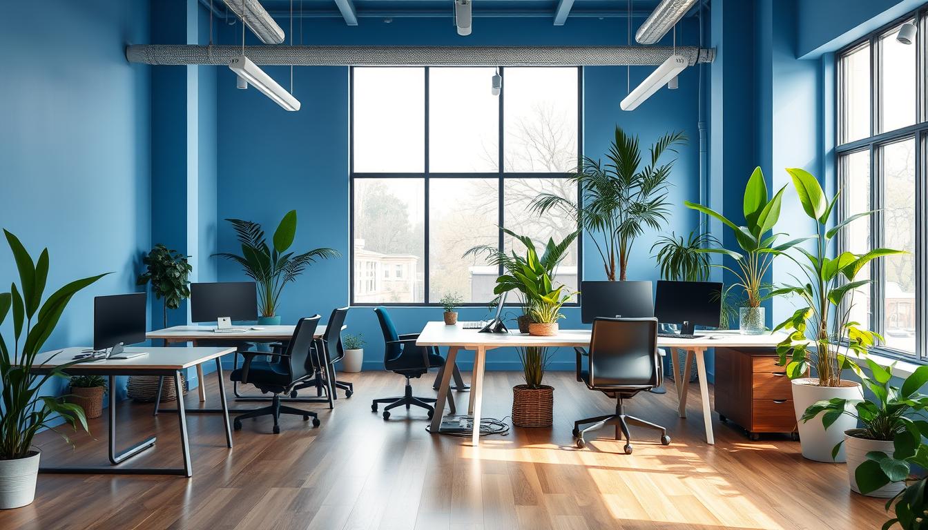
Designers rely on color psychology to design workplaces suited to their purpose. They use blue to aid concentration and calmness. Green reduces eye strain and encourages balance, whereas yellow sparks creativity in small doses. However, too much red can be overstimulating and even lead to conflict.
Biological and psychological responses to color
Colors can cause noticeable changes in heart rate and breathing. Vibrant colors stimulate the brain’s visual areas and affect our mood. A person’s past experiences with color and the context it’s used in also play a big role in their reaction.
How overstimulation from color raises cortisol and sympathetic arousal
Loud, highly contrasting, or neon colors may increase stress responses. Research shows extreme environments, like bright whites, could heighten stress-related hormonal markers. Being around intense color schemes for too long can increase stress, making it harder to relax between tasks.
- Using large amounts of bright color increases stress on our eyes and can make us more tense.
- Using colors like green and blue in small details can help prevent overstimulation and bring calmness.
- The setting and how much color is used are crucial; a bold wall in a relaxation area is different than one in a work area.
Knowing how colors affect emotions is key for design teams and managers. If colors are chosen carefully, taking into account their shade, texture, and how light interacts with them, they can help make the workplace less stressful and more healthful.
Common Office Color Mistakes That Increase Stress
Some design choices in the office may look bold but can actually make stress worse every day. Here are the main mistakes with office colors that up stress levels. We’ll also discuss how to fix these issues and use colors the right way.
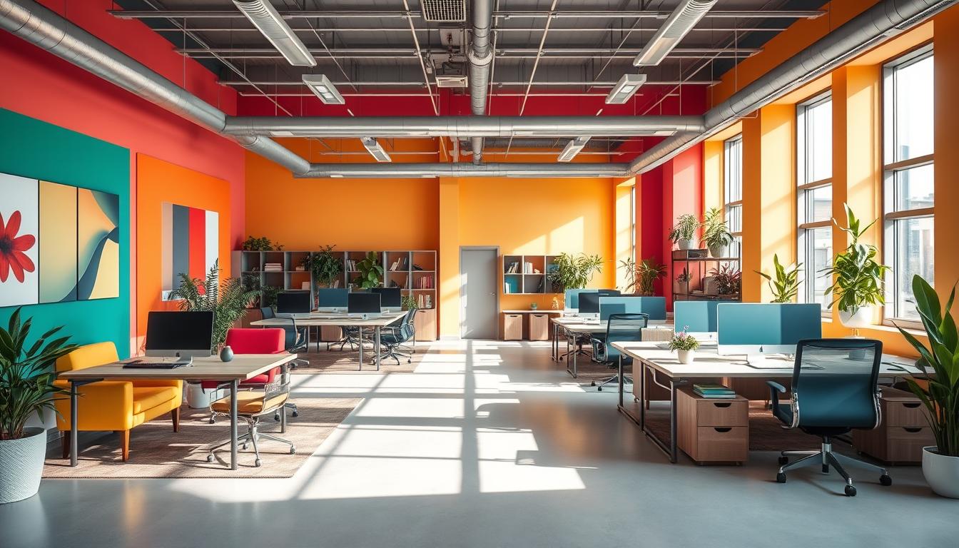
Using overly saturated reds and large red surfaces
Painting big walls in deep red might cause a stress reaction. Studies show bright red can make your heart beat faster and make you feel upset. It’s not the best for places where you need to focus or relax.
Instead of using red all over, it’s better to use it just in small parts. Think about adding red through logos or in areas where a bit of energy is a good thing, like the cafeteria. To keep things calm, choose softer reds like burgundy or terracotta over sharp reds.
Dominant bright whites that read as clinical or sterile
A space all in white might seem very clean but also unwelcoming. Spaces that look too much like a hospital can actually stress us out. To avoid this, mix in some creamy whites, wood colors, and different kinds of lights.
Add warmer lights to make white walls feel soothing, not stark.
Widespread use of neon colors and sensory overload
Neon colors grab your attention but can be too much when there’s a lot of them. Being around too many bright colors for too long can make you tense and distract you. It’s best to use neon colors just in small, energetic spots.
Also put in some gentle colors nearby. This gives your eyes a break and helps balance everything out.
Excessive pure black in low-light areas creating oppressive feeling
While black can look sleek, too much of it in dark places can feel too heavy. This heavy feeling can make people feel sad or trapped. Use black in small details instead of making it the main color of a room.
For a rich but not overpowering look, pick charcoal or deep blue. These colors keep the feeling of depth without making the space feel closed off.
- Audit problem zones for intensity: reduce saturated fields and substitute muted alternatives.
- Introduce texture and warm light to counteract bright white clinical effects.
- Confine neon accents to short-duration spaces to prevent neon sensory overload.
- Use black sparingly to avoid a black oppressive office atmosphere in low light.
Problematic Color Pairings and Contrast Issues
Design choices that seem daring can sometimes make our eyes strain. When walls, furniture, and screens have sharp contrast, it’s hard on us. This can lead to headaches, blurry vision, and discomfort after long hours at work.
High-contrast color schemes, like black-and-white or bright colors, can tire our eyes more. In open-plan offices, these contrasts plus shiny screens mean more distractions. To help, choose tones that are close to each other to ease the strain and keep focus steady.
When office accents don’t match, they create a jarring environment. Neon colors against soft beige can distract us from work and talking with others. Such mismatches make shared areas stressful and can hurt our productivity.
To fix this, select one or two complementary accent colors. Place these accents in areas where they can direct or point the way. Accents should help the main colors, not clash with them. This makes the office feel more harmonious.
The choice between warm and cool colors influences how we feel and interact. Too many warm colors can be too stimulating, while too many cool tones might feel unwelcoming. Mixing warm and cool colors well can create a space that’s both lively and peaceful, fitting its purpose.
Find balance by matching warm fabrics with cool wall colors, or the other way around. Use neutral tones like soft grays or warm woods to even things out. Stay away from harsh warm versus cool colors. Pick less intense colors for needed contrast.
- Reduce stark contrasts near workstations to minimize color contrast visual fatigue.
- Choose accent colors that enhance, not interrupt, shared spaces to avoid clashing office accents.
- Mix warm and cool elements intentionally to maintain a healthy warm-cool color balance.
How Lighting and Natural Light Change Color Perception
Light shapes our view of color. Offices that don’t consider lighting and color perception might pick colors that end up feeling off. Even small changes in daylight or the warmth of a lamp can make a calm wall feel cold or too bright.
Effect of natural light on blues, greens, and whites
Natural light changes how we see blues and greens. Under bright daylight, blues appear fresher and more peaceful. Greens seem richer and more soothing in sunlight. Whites look different based on the sun’s angle; northern exposure can give them a cool, clinical appearance, while direct sunlight makes them creamier.
How cool versus warm artificial lighting alters mood
The mood shifts with warm versus cool lighting. Cool, high-Kelvin lights highlight cool tones, making a room feel more sterile. Warm, low-Kelvin lights soften whites and dim strong colors, offering a cozier atmosphere. Mixing fixtures and using dimmers can help balance the overall lighting.
Testing paint samples at different times to avoid mistakes
Testing paint samples helps avoid expensive mistakes. Put small samples on various walls and examine them throughout the day. Notice how light reflection and nearby elements affect their look. Teams often find that less saturated or slightly warmer colors work best under different lighting.
- Place samples near windows and inside areas to observe how natural light alters colors.
- Look at samples under both warm and cool lighting to see how they affect the mood.
- Do paint sample tests again before the final decision to make sure the lighting and color look right.
Office Color Choices by Zone: Where Certain Colors Backfire
Designing an office by its functions helps avoid costly mistakes. A zone-based approach to color keeps stress down. Small changes in color can improve focus and comfort.
Conference rooms — when energizing colors reduce focus
Bright colors in conference rooms can make focusing harder. Saturated reds or neon yellows can energize for short times but hurt long decision-making.
Use calming blues, muted greys, or warm neutrals in meeting spaces. Save bright colors for walls or panels in quick, creative sessions.
Workstations and open-plan areas — avoid overstimulating hues
Bright colors at workstations can tire eyes and increase stress over time. Mistakes often come from bold walls or contrasting colors near desks.
Opt for soft greens, gentle blues, or light neutrals for better focus. Add texture, plants, and lights to break monotony without overdoing it.
Break rooms and collaboration zones — using color to support relaxation
Calming colors in break rooms help employees relax and recharge. Soft blues, muted greens, and warm beiges encourage rest and easy chats.
Add bright yellows or reds in active spots to boost moods. But keep main colors peaceful to truly help energy recovery.
Reception and client-facing spaces — balancing brand and comfort
Reception areas need a balance when brand colors are strong. Too much color can feel unwelcoming or too formal to guests.
Show brand colors in accents on signs, furniture, or a feature wall. Use warm neutrals and textures elsewhere. Mix with welcoming lights and seating for a professional, yet comfy first impression.
Practical Fixes: How to Correct Stress-Inducing Color Mistakes
Begin by calmly checking areas that make you tense or tired. Look for big, bold colors, stark contrasts, and places where the light feels too cold. Small, careful changes can solve these color issues in the office without having to redo everything.
-
Switch large saturated fields to muted tones. Paint the main walls in softer colors like deep burgundy instead of bright red, or soft mustard instead of bright yellow. This keeps the office interesting but less intense, which can help everyone feel more relaxed.
-
Incorporate calming office colors in work zones. Use gentle blues and greens on important walls or big surfaces. Blue helps with focus and calmness, and green reduces eye strain from long hours of work.
-
Apply an accent color strategy. Use bold colors for furniture, art, or just one wall. This keeps the office lively without being overwhelming.
-
Add warm lighting and natural elements. Add lights with a warm tone to make cool whites softer and the space less clinical. Mix these lights with plants and wooden finishes to balance harsh colors and make the office more welcoming.
To test, paint small areas and check them in the morning and afternoon light. Listen to what the staff think and make small changes as needed. These steps can make office colors less intense, increase calmness, and help everyone handle stress better.
Design Strategies to Prevent Future Color Mistakes
Choosing the right colors begins with understanding how each room will be used. It’s important to figure out if the area is for focusing, group work, or relaxing. Doing this first can help stop color errors before you even start painting.
Assess space purpose before selecting color schemes
Think about what each area is for: hard work at desks, meeting clients, coming up with ideas, or taking a break. Use soothing blues and greens for focus areas and vibrant colors for creative energy. When changing leases, go for neutral colors that future renters will like but still let your brand shine through.
Test colors in-situ and consider employee feedback
Put color samples up where they’ll go and look at them at different times of day. Ask your team what they think. Trying colors in the actual space and listening to what employees say helps spot problems early. This saves money and time later on.
Align color decisions with brand identity without sacrificing well-being
Decorate with your brand’s colors in places like the front desk or marketing spots, but don’t overdo it. Pick softer or deeper versions of your brand colors to keep things comfortable. This keeps your brand’s look strong while making sure the office feels good to be in.
Use color zoning: different palettes for focused, creative, and restorative areas
- Focused zones: soft blues and muted greens that support concentration.
- Creative zones: controlled warm accents for short energizing sessions.
- Restorative areas: warm neutrals and muted greens for recovery.
Different color zones stop too much stimulation and help plan the office layout better. This planning includes lights and furniture that fit each color theme.
By taking these steps, you lower risks, cut down on redoing work, and make spaces that are true to your brand and welcoming.
Conclusion
Choosing the right colors can greatly reduce stress in the office. Avoid colors that are too loud or dark, such as bright reds and deep blacks. Stick to calming shades like soft blues and greens, combined with warm lights. This creates a soothing atmosphere that helps people concentrate better.
When deciding on office colors, think about what each area is for. Try out paint samples to see how they look in different lighting. It’s better to use colorful accents rather than painting a whole room in a bold color. Make sure the colors match the company’s brand, but don’t let that harm employee comfort.
Good office design considers employee input and design principles. Gather feedback from employees, use different colors for different areas, and choose simple color schemes. These steps help create a workspace that boosts focus and reduces eye strain. Teams will find their workplace more calming and efficient, with less stress caused by colors.
Content created with the help of Artificial Intelligence.