Color speaks without using words. It’s the first thing people notice in a home office. This first impression can make a space feel welcoming or not. Studies, like those by Angela Wright, explore how color impacts us without us realizing it.
Choosing the right colors can affect how we think and feel. The colors in a workspace can help us focus better or be more creative. Sometimes, adding a bit of color here and there can make a big difference. You don’t always need a big makeover.
This article explains how certain colors can make a home office better for work. You’ll learn about colors that help with different kinds of work. Plus, it gives tips on trying out colors without too much risk.
Key Takeaways
- Color is the first cue people notice and shapes instinctive responses to a workspace.
- Workspace color psychology connects hues to focus, creativity, calm, and energy.
- Small interventions—accent walls, cabinetry, accessories—can change mood without major cost.
- Use real paint samples and named swatches, like Sherwin‑Williams and Benjamin Moore, for practical guidance.
- Productive home office colors should match the task: choose tones that support attention or creativity as needed.
Why color matters in home office design: mood, focus, and productivity
Colors shape our first impressions and affect us during long hours of work. Even slight changes in color can influence our feelings, productivity, and how a room supports our tasks. Designers and scientists use these ideas to make practical decisions for home offices.
How color influences emotions and behavior
Colors can spark natural reactions like happiness, alertness, or peace. For instance, red boosts energy and heart rate, yellow encourages warmth and hope, and blue promotes trust and tranquility. Green brings a sense of restoration and calm. These effects shape how we feel in a space.
But, our personal experiences, culture, and context can alter these reactions. A color that calms one person may agitate another. This shows why it’s crucial to test colors in the actual workspace instead of just relying on charts.
Color’s measurable effects on work performance
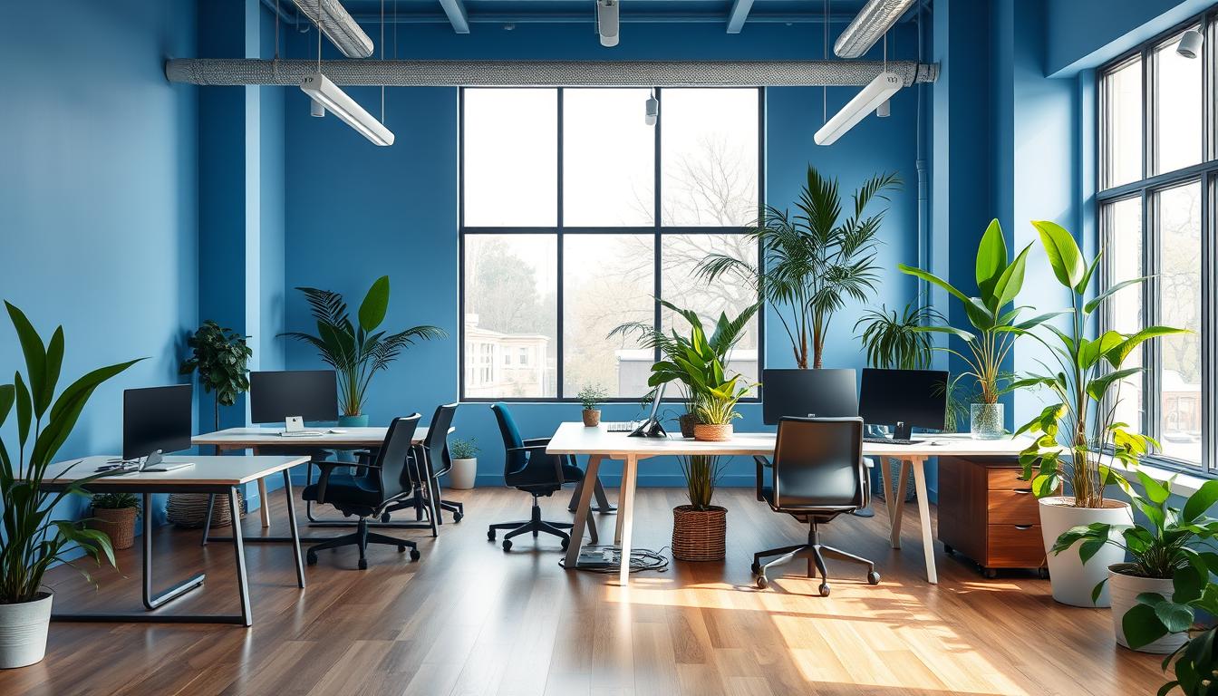
Research shows that color can affect our work. Blue shades help with focus and analytical tasks, enhancing attention to detail. Green minimizes eye strain and stress, which is perfect for long work hours and creative projects.
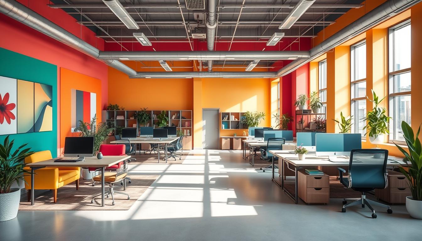
However, bright reds or strong yellows might be too stimulating and hinder performance over time. It’s better to use colors as accents instead of painting entire walls in them. Studies highlight the importance of moderation and thoughtful placement of vibrant colors.
Context matters: intensity, saturation, and combinations
The intensity and saturation of colors can alter how we see them. Bright, deep blues can energize, whereas soft grey-blues can calm us down. Understanding the role of saturation helps explain why the same color can have different effects based on its shade and finish.
- Use cool accents like blue in collaboration zones to sharpen focus and communication.
- Place green near workstations where long hours and eye comfort are priorities.
- Reserve red for brief, high-energy areas like pin-up boards or exercise corners.
Neutral tones and materials can balance out bold colors. White can make a room feel larger by reflecting light. Warm woods and brass add softness to cool colors, avoiding a too-sterile look. Choosing colors based on task needs turns theory into effective design.
Color Psychology for Home Office Design
Choosing the right colors makes your space more effective. This guide tells how to pick office colors based on your job, how to mix them with neutrals, and gives tips for coloring your home office you can try today.
Choosing colors based on the type of work you do
Blue and cool tones help with analytical work. Colors like slate blue or navy increase focus and make you look serious during video calls with clients.
If you’re in a creative job, greens and mid-tones are best. Colors like sage, teal, and muted olive are easy on your eyes and help keep your creativity alive. Introduce yellow or orange accents for extra creativity.
Warm accent colors are great for sales or coaching jobs. They make you feel more energetic. Use yellow and orange for activity, and red in small areas for tasks that need quick motivation.
For those working long hours or at night, pick green. Mid-green on your walls or cabinets reduces eye strain from staring at screens too long.
Balancing primary color choices with neutrals
Neutrals ground your space. White makes it feel larger by reflecting light. Gray is calming and neutral. Black adds a polished contrast.
In rooms that are small or not very bright, start with light neutrals. Then add colors through furniture, fabrics, and art for depth without overwhelming the space.
Use neutral tones with colorful accents to keep your office from feeling too busy. This keeps your work area adaptable for different tasks and feelings.
Room-by-room recommendations for home offices
- Dedicated private office: Go for soft blue or green on walls, furniture in wood tones, and cozy textiles. Use navy for a professional video call background.
- Multi-use or guest room: Begin with off-white or light gray. Add movable accents like pillows and framed art in yellow or green.
- Small nook or closet office: Use white or a light neutral on walls to keep it bright. Paint built-ins sage or dusty rose for charm without clutter.
- Video and meeting backgrounds: Choose colors that aren’t too bright like soft blue, muted green, or warm neutrals. Add wood, plants, and textured fabrics for warmth.
When picking paint, look at palettes from Sherwin-Williams and Benjamin Moore for real examples. Use these home office coloring tips to try out small spots before painting the whole room.
Best colors for focus, creativity, calm, and energy in a home office
Choosing the right colors for a home office shapes your mood and work performance. A smart color mix promotes focus, peace, creative vibes, and a balanced look. Below, find quick tips on using these colors effectively with your furniture and decorations.
Blue for concentration and mental clarity
Blue is top-notch for focus, says research on workplace performance. Apply cool blues on an accent wall or shelves to boost concentration and thought clarity. Combine blue with warm wood tones and soft lighting to keep things cozy, not chilly.
Green for restorative balance and long hours
Green sparks creativity and reduces eye strain with its calming nature vibe. Use sage or moss tones for built-ins and place plants near your desk for a refreshing space. Opt for soft greens to keep your mind on track without distractions.
Yellow and orange for optimism and creative spark
Soft, buttery yellows uplift your spirits and keep your mind sharp. Use yellow accents on storage pieces or chairs to boost creative thinking. Oranges add a welcoming touch to pinboards or cushions, making team work more enjoyable.
Red for motivation and action, used sparingly
Red grabs attention and spurs you into action, but only in small amounts. Limit red to elements like clocks, lamps, or active zone decor. Big red spots in study areas might cause anxiety, so use it carefully.
Pink and purple for approachable creativity
Soft pinks, like dusty rose, mix playfulness and peace for brainstorming sessions. Lavender and gentle purples inspire creativity and wisdom without dominating a room. Add them in touches like fabric, drawer linings, or art bits.
White, gray, and black for neutrality and contrast
White opens up spaces and gray calms the visual scene. Black grounds the design and draws attention to shapes. Use these neutrals as your base, then layer in vibrant home office colors with accessories and built-ins for a customizable look.
Practical design strategies: applying color to furniture, walls, and decor
Think of color as a strategic tool. Use a primary neutral and add meaningful accents for a calm, functional space. Adjust these elements as your needs change over time.
Accent walls, built-ins, and cabinetry tips
Position accent walls behind desks or shelves for depth on camera. Paint one wall in a soft color to keep focus and avoid tired eyes.
Add color to built-ins and cabinets with soft tones like sage or navy. For cabinetry, keep most parts neutral but use bold colors for small areas.
Lighting, textures, and materials that change color perception
Natural light affects paint color, so examine walls at different times. Watch how light and shadows change the look.
Finish type matters. Matte paint reduces glare, while gloss increases color depth. Adding warm metals can balance cooler colors.
Use rugs, curtains, and plants to add warmth. These elements enrich color and make long work hours easier on the eyes.
Combining colors: palettes and sample schemes
Start with a neutral base, add a functional color, and one or two accents for creativity. This approach helps maintain balance.
- Sherwin-Williams Honeydew with Benjamin Moore Cinnamon Slate for a soft, warm pairing.
- Benjamin Moore Sea Star with a muted yellow accent for calm energy.
- Sherwin-Williams Overjoy as a pop color with neutral walls to lift the mood.
Experiment with sample cards and swatches. Check how they look with your room’s lighting and against key materials.
Small-space solutions and color for video backgrounds
Use light neutrals in small rooms to make them feel larger. Add color with painted shelves or artwork to keep the space open yet detailed.
For video calls, choose soft, calm colors. Include a plant or wood to look professional and inviting. Avoid distracting viewers with too much color.
Stay away from bright colors and busy patterns near the camera. They can be distracting. Instead, aim for subtle contrasts and textures for a good look on screen.
Testing and implementing color choices: low-risk ways to experiment
Start with small, easy-to-change items. Throw pillows, desk gadgets, lamps, and framed art are great for this. These help you check the effect of colors on your mood and attention. Before changing a whole room, try painting just inside a cabinet, the back of a shelf, or one accent wall.
Always use real paint samples. Apply them with peel-and-stick swatches or in pots. Watch how they look in the morning, midday, and evening light. Also, see how different your colors look under the lights you use for working. This will show you how tones shift.
It’s important to try finishes on various surfaces. The color looks different on matte walls, semi-gloss trims, and wooden cabinets. Paint a big 2’x2′ sample on each and live with it for a few days. This helps you really see the color’s intensity and how it holds up over time.
- Start with accents and accessories for easy color experiments before you decide to paint.
- Sample paint tests and peel-and-stick swatches help you see color changes at various times.
- See how different lights, like task lamps and overhead lighting, affect each color.
It’s smart to get opinions on your choices. Notice if certain colors, like blue, help with focus. Or maybe yellow brings more energy for your calls. Ask others in your home or those you video chat with often how the colors look on camera.
If a color seems too strong, you can always adjust. Maybe tone it down, add some neutral colors, or change the accents. It might take trying different options to get your office just right. The goal is to find the perfect mix of function and style.
- Start with buying sample pots and big swatches.
- Paint large patches on key surfaces and watch how they look over several days.
- Get feedback, then tweak color strength, where it’s used, or the materials themselves.
Conclusion
This guide makes choosing office colors simple. Pick colors that suit your work, start small, and add neutral tones for balance. Blue and green are great for focus during long work hours. Colors like yellow, orange, red, pink, and purple bring out optimism and creativity when used sparingly. Neutrals such as white, gray, and black help keep things calm and let the brighter colors stand out.
Start with easy changes to use color psychology to your advantage. Swap out accessories, paint a small piece, or test colors on the wall. See how light and placement affect your mood and focus. Then, tweak as needed. Using paints from brands like Sherwin-Williams or Benjamin Moore ensures your colors match your goals well.
Even small adjustments, like an accent wall or better lighting, can greatly enhance your home office. The key is to match color, brightness, and the job you’re doing. Keep experimenting until your office is both a productive and peaceful place.
Content created with the help of Artificial Intelligence.